Website redesign
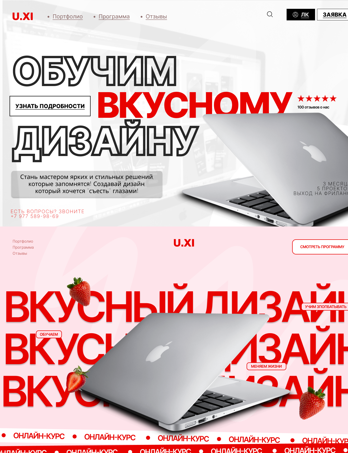
I redesigned the main page to make it more emotional, bright, and "tasty," in both a literal and visual sense:
A strong visual rhythm: the repeating large text "TASTY DESIGN" creates dynamics and visual pressure
Added accents with strawberries, enhancing the metaphor of "tasty design" and adding playfulness
The laptop now extends beyond the layout, creating a sense of depth and engagement
Accents are placed through stickers and banners ("Training," "Changing lives," "Watch the program"), making the interface interactive and lively
The color palette has become more saturated — more red, more contrast, the mood of the page has become bolder
Redesign result:
The page has become more emotionally powerful, closer to a youth and creative audience
The visual style has become recognizable and memorable
A clear idea of the course is conveyed — learning bright, noticeable, unconventional design
Visual storytelling has been improved: strawberries, a laptop, and large headlines work together as a visual metaphor.
 Pardubice