Website of an organization that creates inclusive housing
Design goals: the site should reflect inclusivity, accessibility, and modernity, as well as provide easy access to resources, information, and recommendations for inclusive housing.
Design solutions:
Color palette: use of calm and neutral colors such as blue, navy, and gray, which are associated with reliability, accessibility, and tranquility. These colors help create an atmosphere of openness and trust. Fonts: for headings, we used Montserrat, a modern and easy-to-read font that provides clear and expressive information. For the main text, we chose Open Sans, a font known for its readability and user-friendliness, which is very important for inclusive design. Other solutions: Implementation of intuitive navigation and accessible interfaces, including alternative text descriptions for images, large controls for easy interaction with the site.
#Web-design #websites #website_design
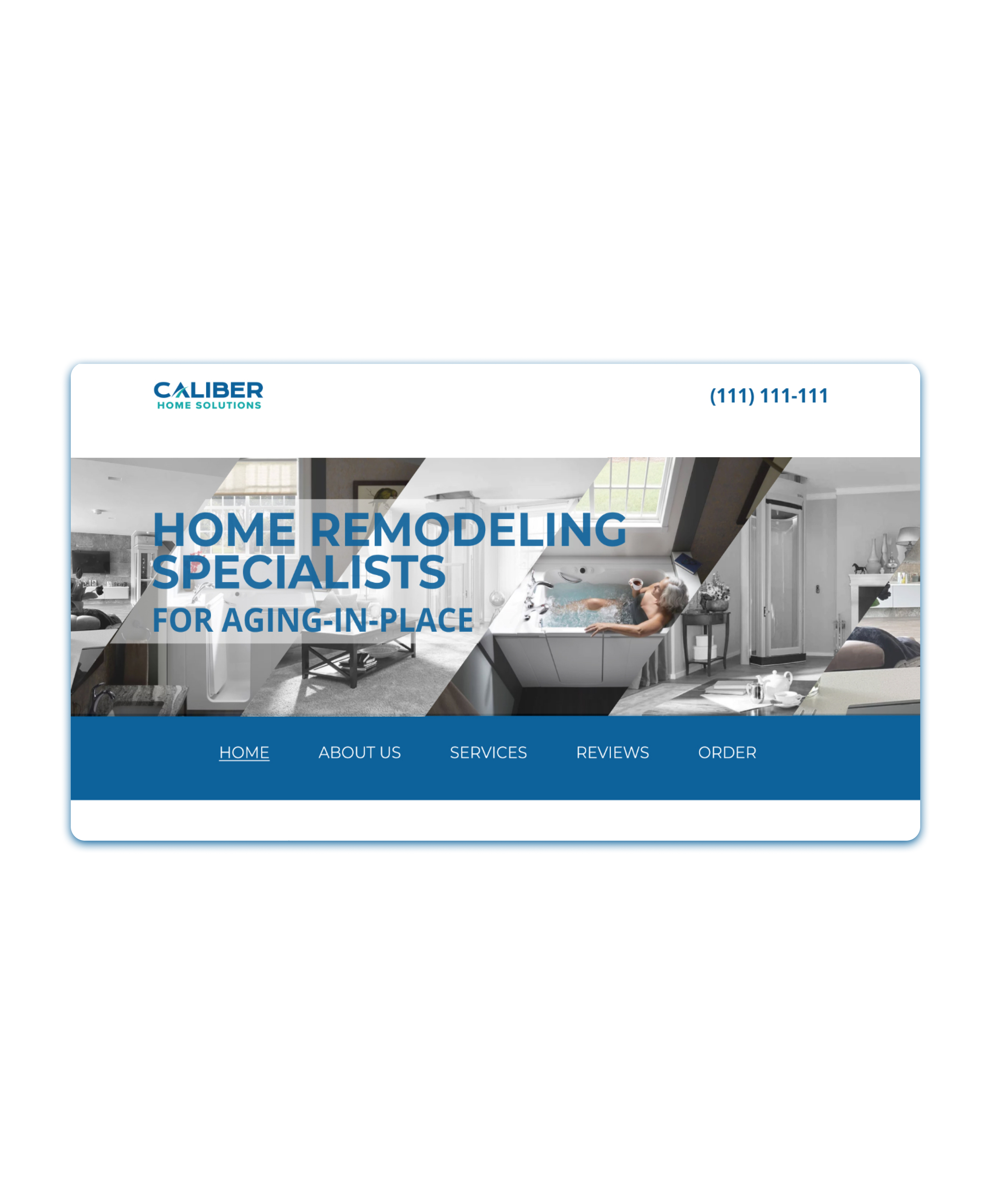