SO well — Packaging design
Packaging and label design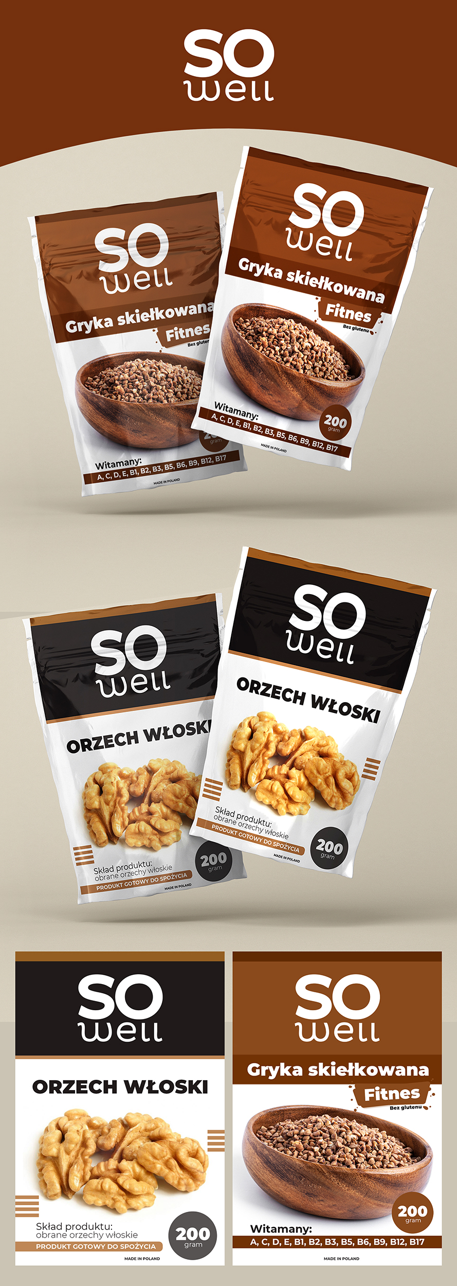
Development of a series of designs for the doypacks of the Polish natural products brand "SO well" (walnuts, sprouted buckwheat).
Key solutions:
* Clean minimalism: Use of a white background to convey the naturalness and eco-friendliness of the product.
* Clear navigation: Color coding of the upper branding block for easy differentiation of various items (SKUs) on the shelf.
* Focus on the product: Large, contrasting food zone and highlighting key markers (weight 200g, vitamin composition) for quick reading by the customer.
Goal: To create modern packaging that stands out on the shelf due to the absence of visual noise and immediately communicates the benefits of the product.