Whale camp offers premier diving experiences, allowing enthusiasts to explore stunning underwater landscapes and vibrant marine life. With experienced guides and state-of-the-art equipment, Whale camp ensures a safe and unforgettable adventure for divers of all skill levels. Dedicated to promoting marine conservation, Whale emphasizes the importance of protecting our oceans.
Solution
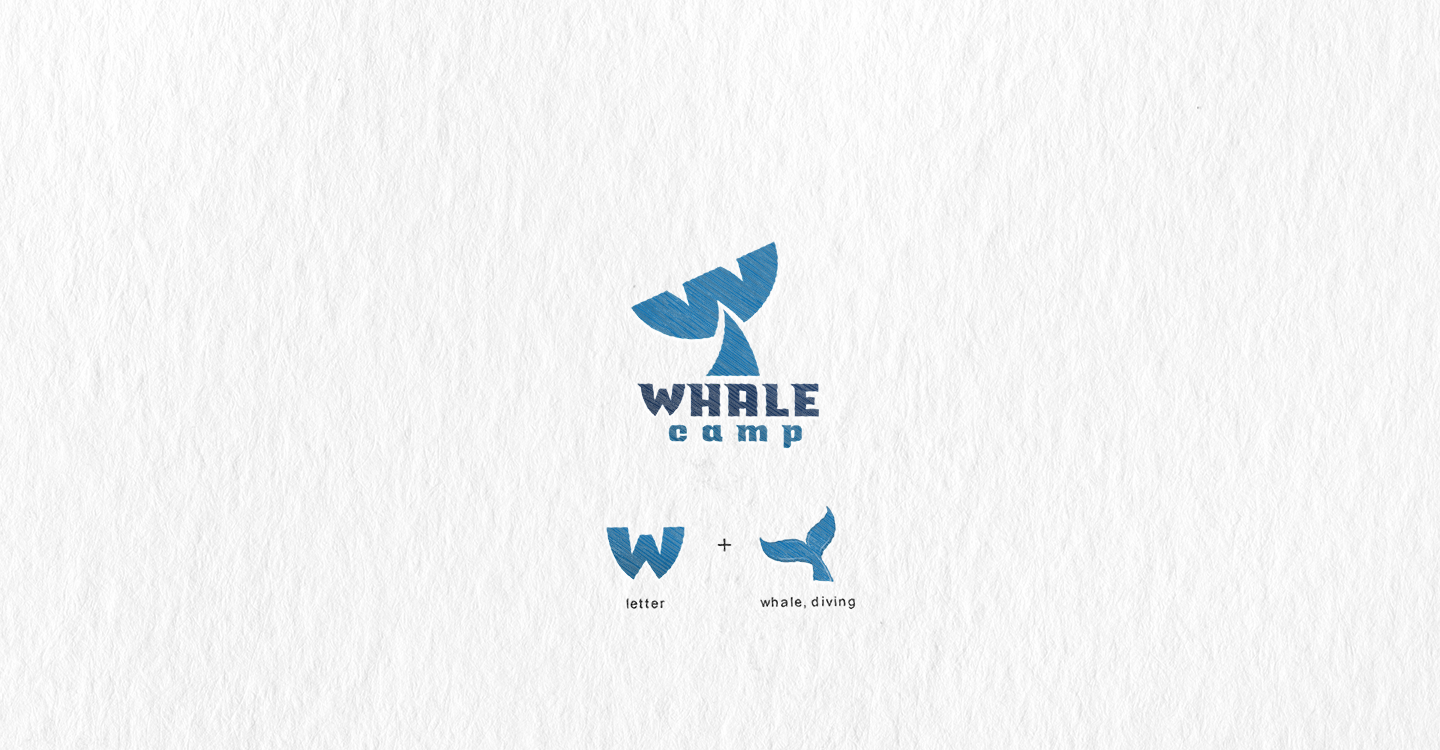
I designed the logo with a whale’s tail diving into the water, creatively incorporating the tail's shape into the form of the letter "W," which represents the first letter of the company name. This design visually connects the whale with the brand identity, highlighting the diving theme. The use of flowing lines and curves in the tail evokes the elegance and movement of the ocean. I chose a color palette of deep blues to reflect the tranquility and depth of the sea. The company name "Whale camp" is featured in a modern, legible font that complements the icon. This logo effectively captures the essence of underwater exploration while maintaining a strong and recognizable brand identity.
Solution
I designed the logo with a whale’s tail diving into the water, creatively incorporating the tail's shape into the form of the letter "W," which represents the first letter of the company name. This design visually connects the whale with the brand identity, highlighting the diving theme. The use of flowing lines and curves in the tail evokes the elegance and movement of the ocean. I chose a color palette of deep blues to reflect the tranquility and depth of the sea. The company name "Whale camp" is featured in a modern, legible font that complements the icon. This logo effectively captures the essence of underwater exploration while maintaining a strong and recognizable brand identity.