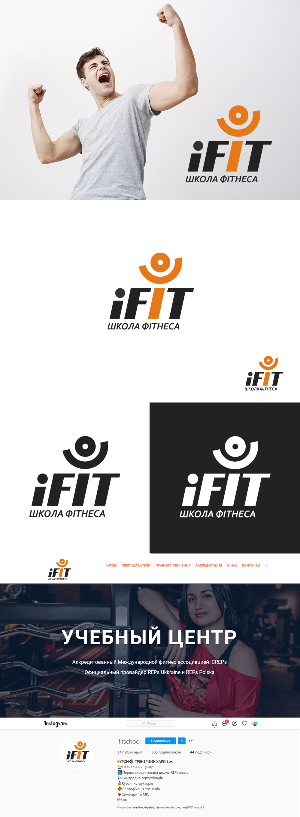
Idea: the iFIT logo represents the community of targeted professionals in their business. Because the main resource is people (people do for people), a symbol from the letter I and circles was created - a person with lifted, slightly turned hands,
As a sign of a desire to be better; to constantly develop and believe in yourself.
#logotype #logotype #logomaker #identity #logotype #logodesign #logomaker #identity
As a sign of a desire to be better; to constantly develop and believe in yourself.
#logotype #logotype #logomaker #identity #logotype #logodesign #logomaker #identity