UX|UI
Our app helps users stay informed about current threats in Ukraine. The logo is designed to not only signal an alert but also provide information about the reasons for the threat.
We wanted the logo to immediately convey a connection to emergency alerts and information. Initially, we considered using a megaphone with a rocket, plane, and drone, but this proved too complex.
At first, we explored several designs featuring a megaphone indicating different threats. However, we realized that simplifying the design would enhance its clarity.
Initially, we thought about using the colors of the Ukrainian flag but decided to use the colors already present in the app and company branding instead.
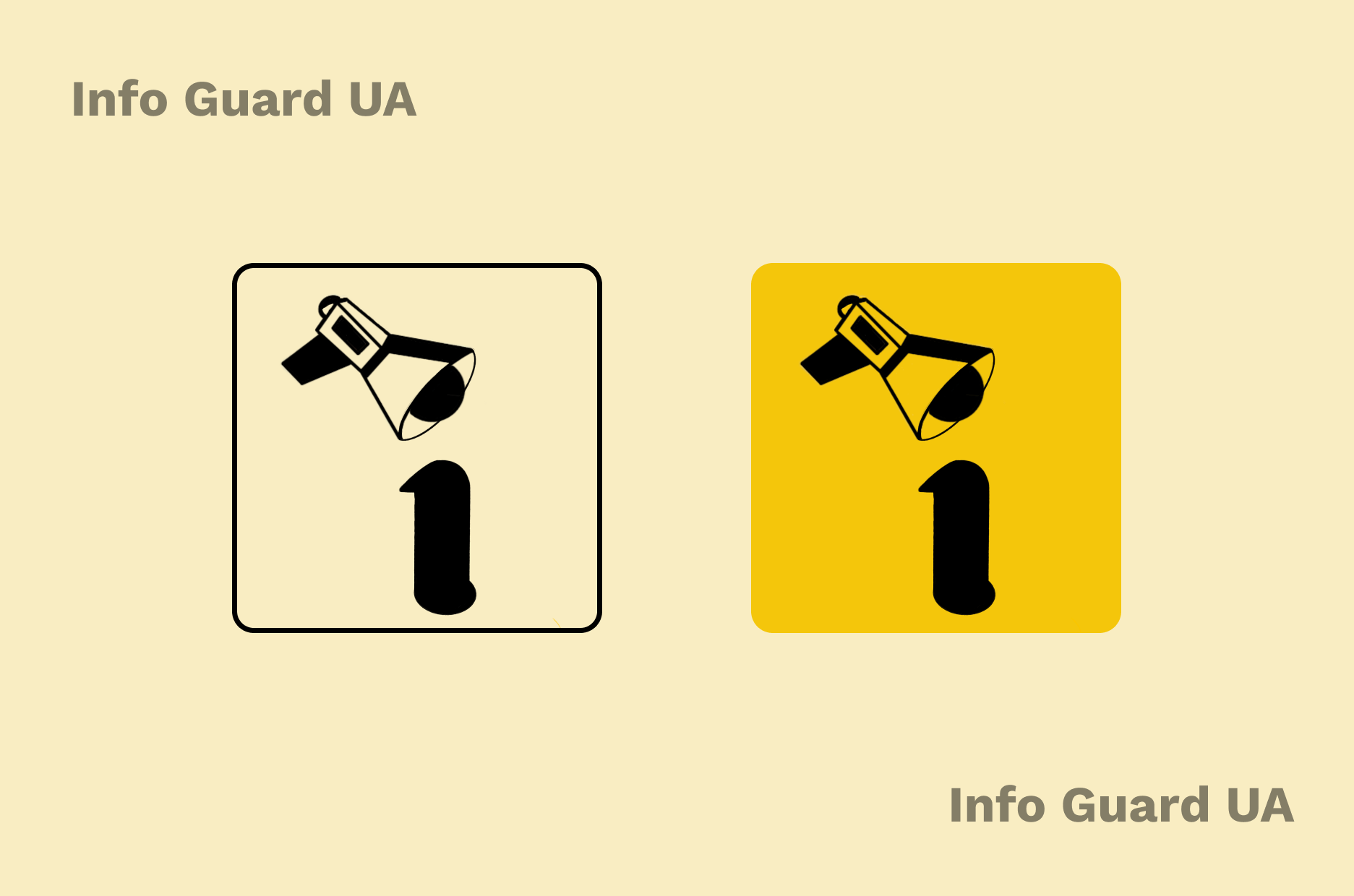
After several revisions, we settled on a simple and memorable design, where the dot of the letter "i" is replaced by a megaphone. This made the logo more clear and stylish.
The final logo effectively conveys the app's purpose and is easy to remember. It helps users quickly understand that the app is related to alerts and threat information.
We checked how the logo appears on light and dark backgrounds to ensure it remains visible in different conditions.We showed how the logo fits into the app’s interface to see how it blends with other elements.
The simplified logo proved effective and easily recognizable. It clearly communicates the app’s purpose and helps users quickly grasp its function.
We wanted the logo to immediately convey a connection to emergency alerts and information. Initially, we considered using a megaphone with a rocket, plane, and drone, but this proved too complex.
At first, we explored several designs featuring a megaphone indicating different threats. However, we realized that simplifying the design would enhance its clarity.
Initially, we thought about using the colors of the Ukrainian flag but decided to use the colors already present in the app and company branding instead.
After several revisions, we settled on a simple and memorable design, where the dot of the letter "i" is replaced by a megaphone. This made the logo more clear and stylish.
The final logo effectively conveys the app's purpose and is easy to remember. It helps users quickly understand that the app is related to alerts and threat information.
We checked how the logo appears on light and dark backgrounds to ensure it remains visible in different conditions.We showed how the logo fits into the app’s interface to see how it blends with other elements.
The simplified logo proved effective and easily recognizable. It clearly communicates the app’s purpose and helps users quickly grasp its function.
 Київ
Київ