Adaptive head screen and menu
The modern website is adaptative. That is, it is correctly understood under the device on which it is viewed, as well as under its peculiarities.
You can see 6 different screenshots:
The computer screen is 1440x900.
On a large computer screen 1920x1080.
On a tablet with a horizontal orientation of 1024x768.
On a tablet with a vertical orientation of 768x1024.
On the smartphone with a horizontal orientation of 812×375 pixels.
On the smartphone with a vertical orientation of 375x812 pixels.
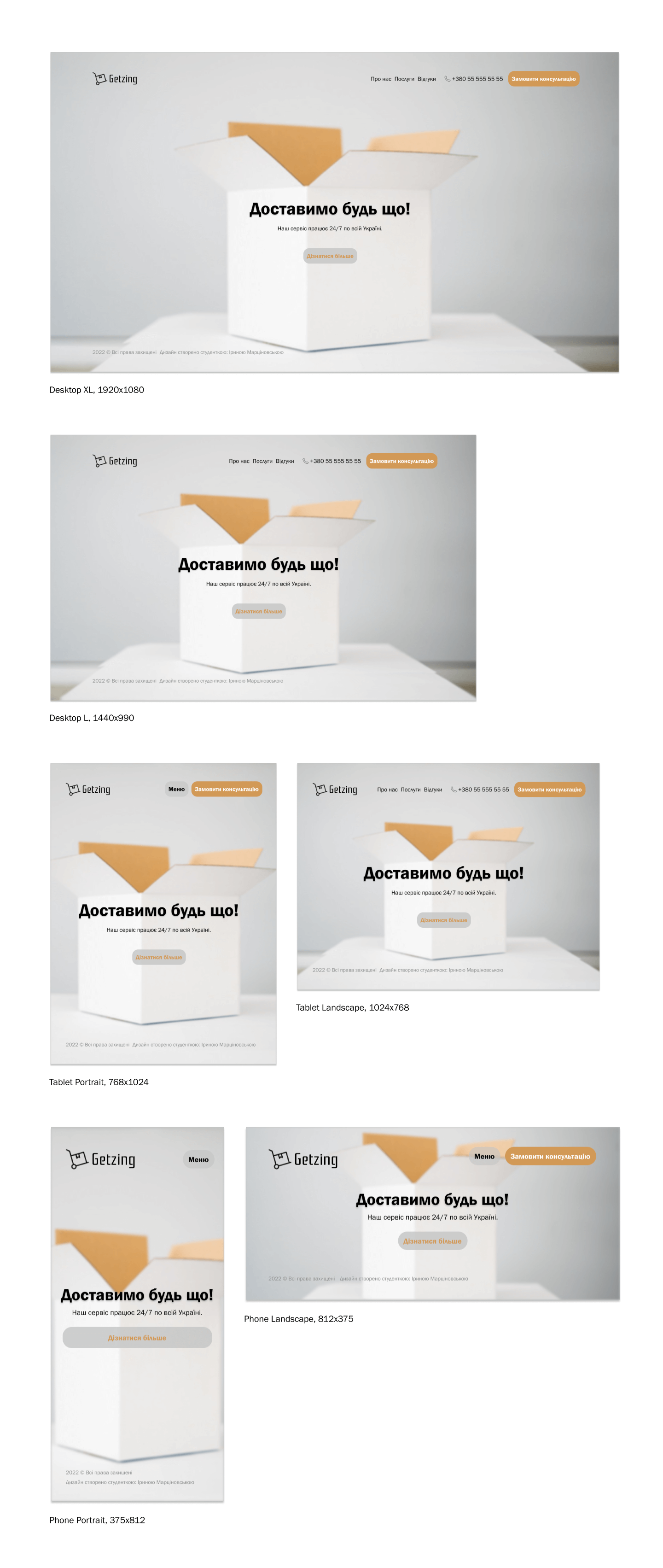
 Kolomyya
  Available for hire