Angel’s jewelry
Development of the identity for the jewelry brand Angel’s jewelry, which combines the aesthetics of dark romance and modern fashion design.
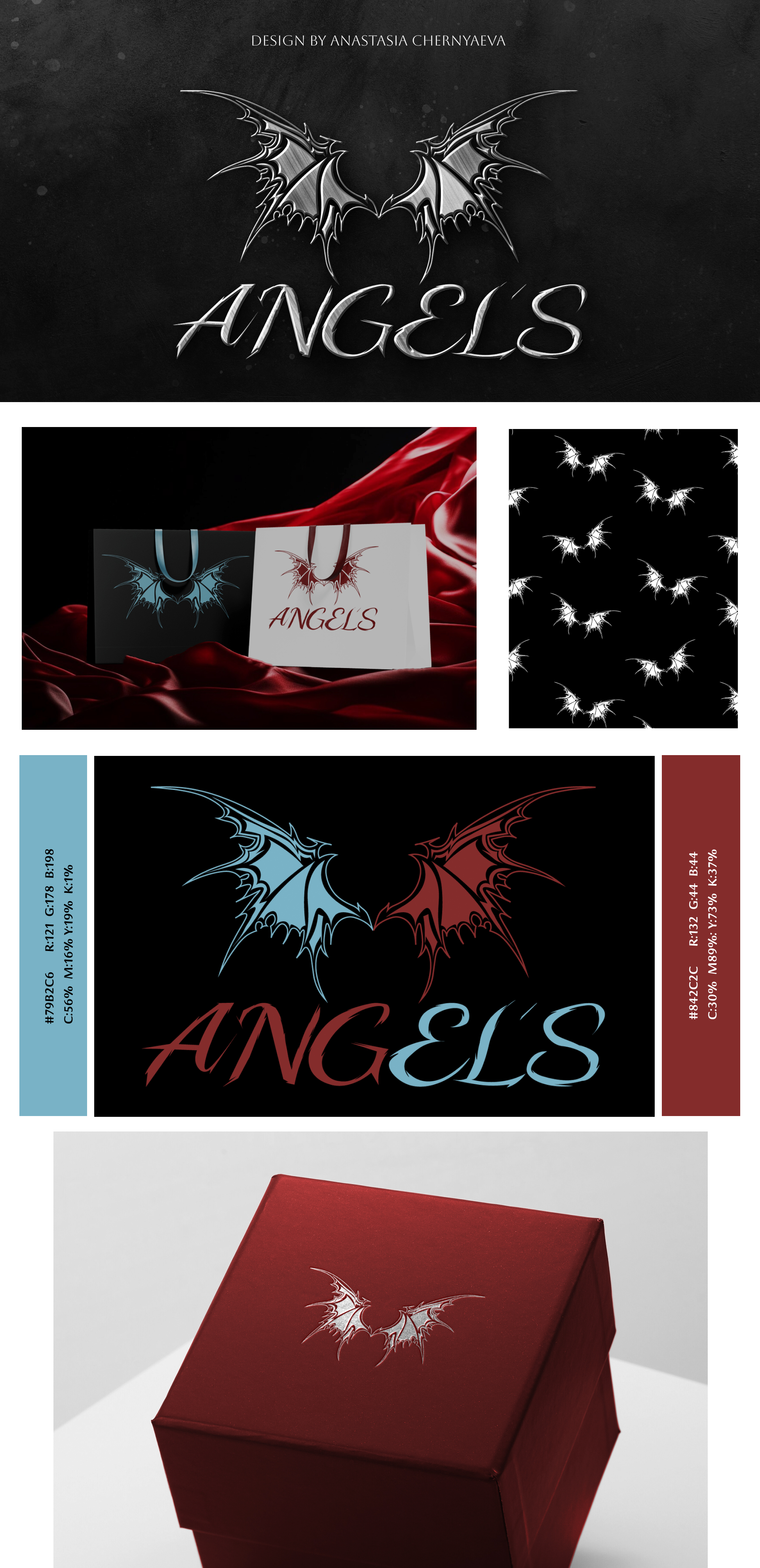
The foundation of the visual concept is the symbol of wings, executed in a sharp, graphic style with a slight gothic mood. This approach creates a balance between tenderness and strength, emphasizing the duality of the brand's image.
The logo has a distinctive character and adapts well to various media — from packaging to patterns and advertising materials. Additionally, a branded pattern was developed based on elements of the logo, enhancing brand recognition.
The color palette is built on the contrast of cool blue and deep red, symbolizing opposition — calm and passion, light and darkness. This solution adds emotionality and expressiveness to the brand.
The identity is easily scalable and looks relevant both in digital environments and on physical media, including packaging.
 Lvov
Lvov