AquaVita
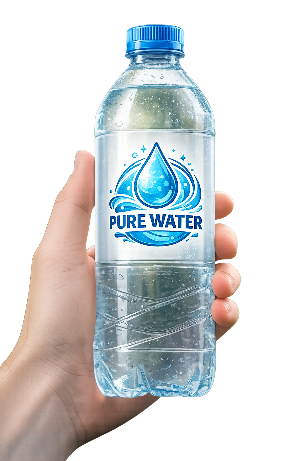
During the work, I developed a logo for a drinking water brand. First, I analyzed which elements best associate with pure water and freshness. After that, I chose the main symbol — a water droplet, complemented by waves and decorative elements.
For the design, I used blue and white colors, as they symbolize purity, reliability, and naturalness. A simple and clear font was also selected, which harmonizes well with the overall style of the logo.
As a result, a modern and recognizable design was created, which can be used on bottle labels, promotional materials, and the brand's products.
 Vinnytsia