RAILFAN
BAHNFAN — Mobile Application Design
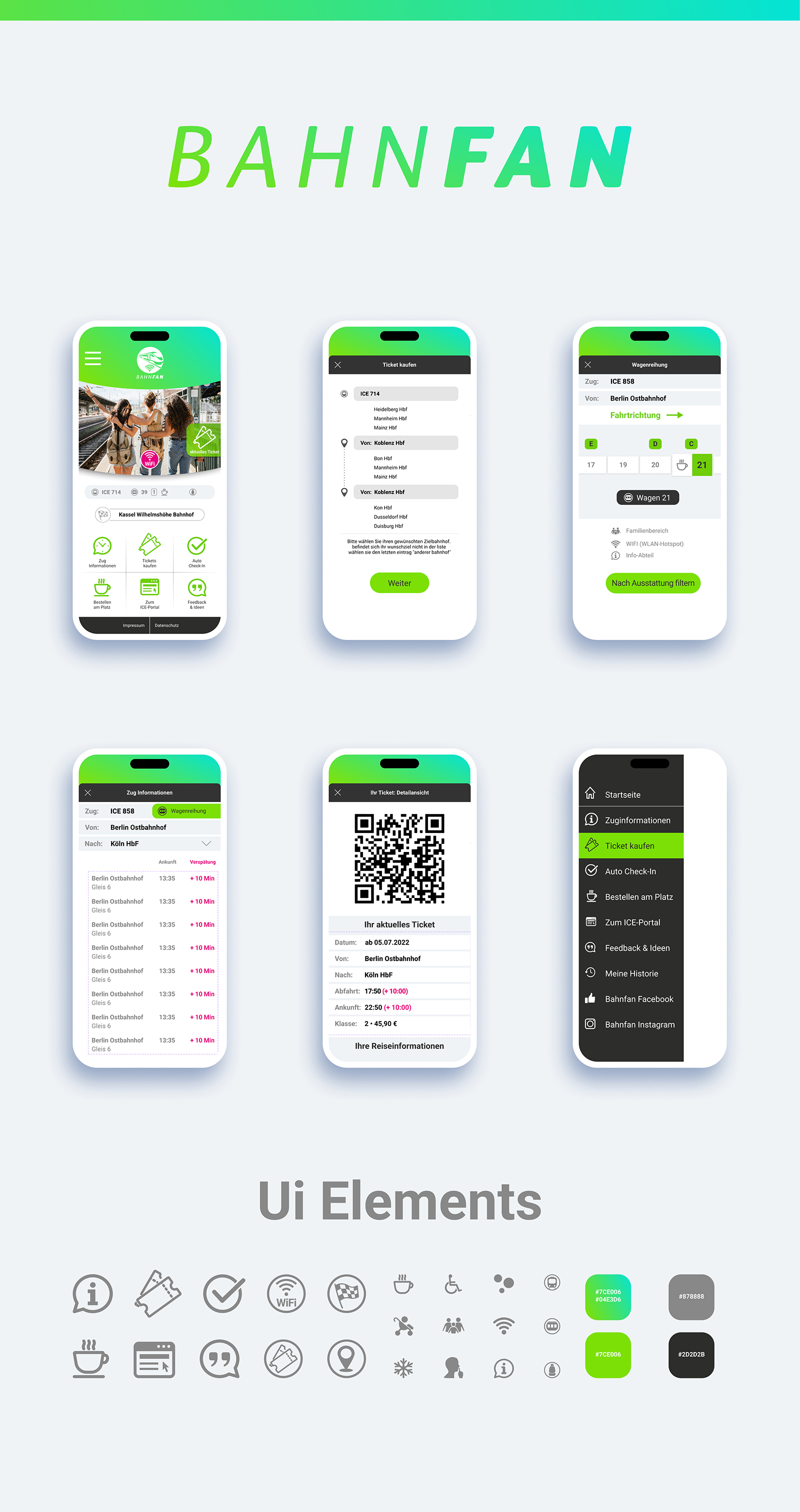
I created a comprehensive design project for the BAHNFAN mobile application, aimed at German-speaking railway passengers. The project covered three key areas: branding, development of a design system, and user interface design, which together form a cohesive and user-friendly digital product.
Scope of Work
1. Branding
A modern BAHNFAN logo was developed using clean geometric shapes and a structured visual style. A brand color palette and supporting graphic elements were also created to form a recognizable and cohesive visual identity for the application.
2. Design System (UI Elements)
To ensure interface consistency, a library of UI components was created, which includes:
• A set of icons for functions related to railway transportation (tickets, Wi-Fi, passengers, carriage equipment, etc.);
• A defined color palette with specific color codes (gradient, bright green, gray, and dark gray);
• Reusable basic UI components for scalable interface design.
This design system helps maintain visual consistency and speeds up further product development.
3. User Interface Design (UI)
Detailed layouts for the main screens of the mobile application were developed.
Home Screen
Contains images of travelers at the railway station, main navigation icons, and a list of key application features.
Train Information Screen
Displays the full route with intermediate stations, arrival times, and delay indicators highlighted in the interface.
Ticket Screen
Shows trip details: date, departure and arrival stations, travel duration, and a large QR code for ticket scanning.
Ticket Booking Screen
Contains a search form for selecting departure and arrival stations, as well as the travel date.
Seat Selection Screen
Displays a detailed layout of the carriage (e.g., "Carriage 21"), the direction of train movement, and icons for available amenities such as family zones and Wi-Fi.
Side Menu
A dark navigation panel with a vertical list of application functions and links to social media.
 Kyiv
Kyiv