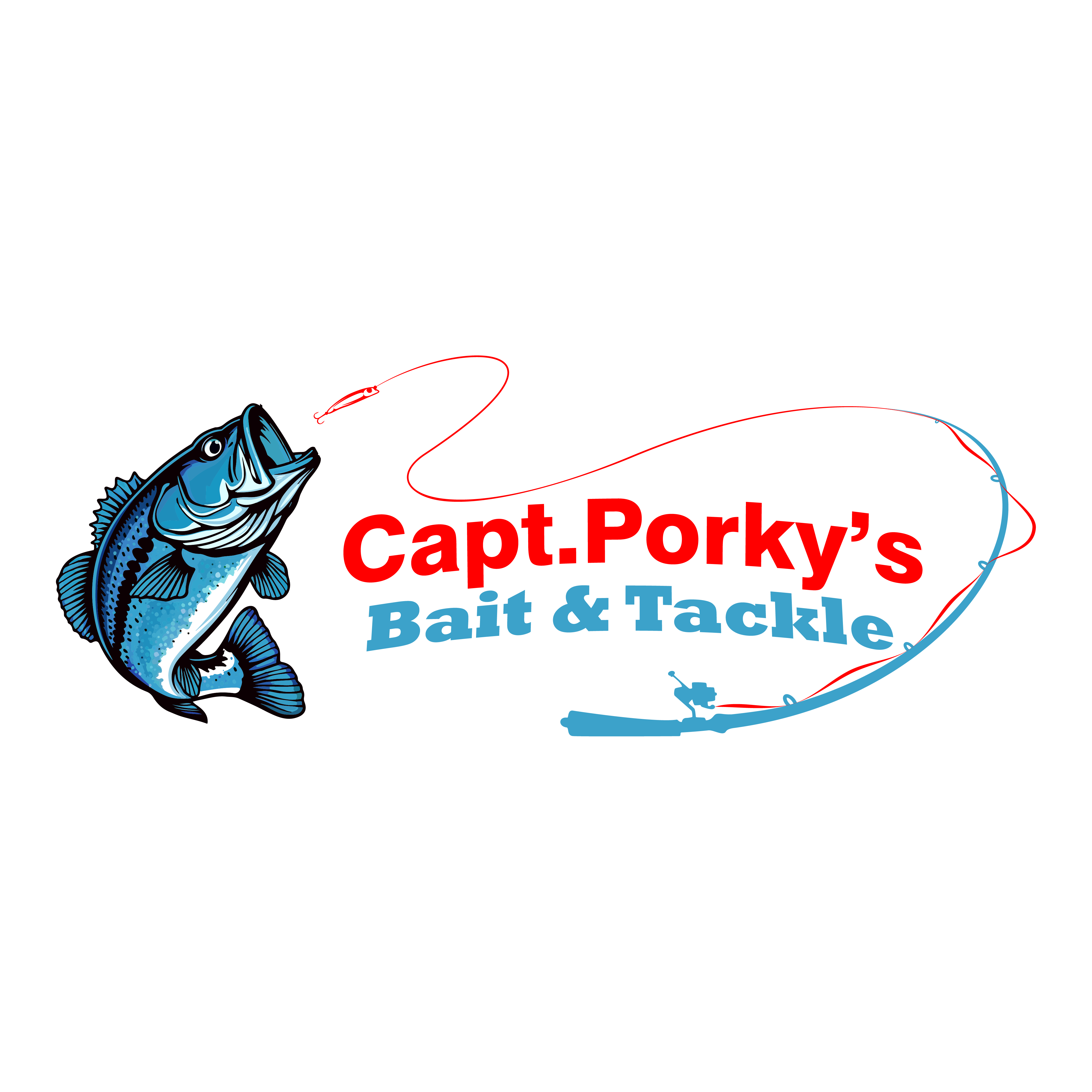
Developed a fresh, high-contrast color variation for the "Capt. Porky’s" branding system.
Color Theory: Applied a sky-blue and white palette to create a cleaner, more modern nautical feel compared to traditional red/black schemes.
Vector Precision: Detailed linework on the fish mascot was preserved to ensure the design remains sharp on dark backgrounds.
Cohesive Design: Maintained brand consistency through the use of the signature banner, fishhooks, and custom typography.
Purpose: This variation was designed specifically for lightweight summer apparel and vinyl decals.