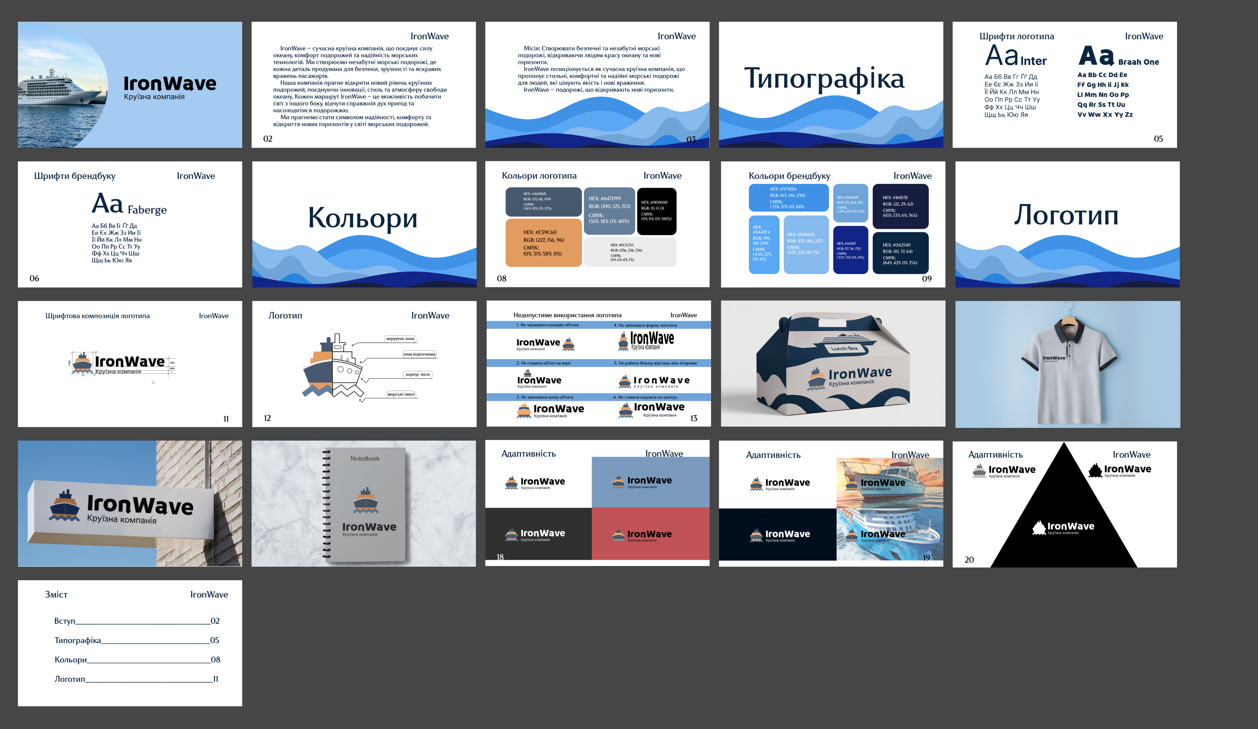
The project includes a complete cycle of creating a corporate identity, from the logo concept to a detailed guideline for brand usage across various media. The main goal was to form a modern, dynamic, and at the same time reliable image of a company specializing in sea travel. The visual strategy is based on a contrasting combination of deep dark blue, symbolizing the ocean, and an energetic orange accent that adds recognition and character to the brand. Within the project, a comprehensive brand book of 22 pages has been developed, containing the logic of the logo construction, rules for free space, primary and secondary color palettes, as well as a detailed typography grid for print and digital resources. Special attention has been paid to the practical application of the style: designs for business documentation, branded envelopes, business cards, and souvenir products have been developed, as well as visualizations of branded clothing and corporate accessories. The created identification system ensures the integrity of brand perception at all levels of communication, emphasizing the professionalism and premium level of service of the cruise line.