Candyland Confections
This work is my own creative project, not commissioned, but made for myself. It represents branding and design for a fictional candy brand called "Candyland Confections."
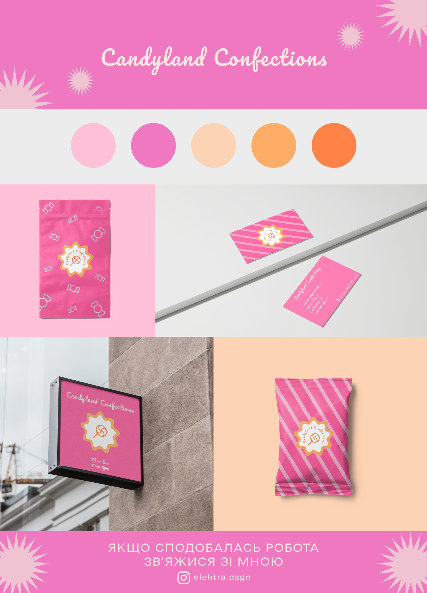
Branding and style:
The main color palette is based on pink and warm shades (light pink, vibrant pink, peach, orange). These colors create a sense of joy, lightness, and sweetness, which is perfect for a brand related to confectionery. The font used is soft and rounded, adding a playful and friendly look to the entire design.
Design elements:
The packaging with a pink background and graphic elements of candies looks bright and appealing. Business cards are made in the same style using striped patterns and vibrant colors. The logo consists of a bright icon resembling a stylized candy or a symbol of sweetness, which immediately emphasizes the brand's theme.
Exterior sign:
The design of the sign on the facade shows how the logo and style look in real application. The pink panel with white and yellow elements evokes associations with a confectionery and creates a positive image for potential customers.
Overall style:
The work is done in a playful and light style, suitable for a brand focused on sweets and children. The main emphasis is on bright and attractive colors that instantly associate with fun and festivity.
| |
Anastasiia-Elektra Lishman
 Chernovtsy 17 0 Chernovtsy 17 0
|
17 Safes completed
On the service 1 year