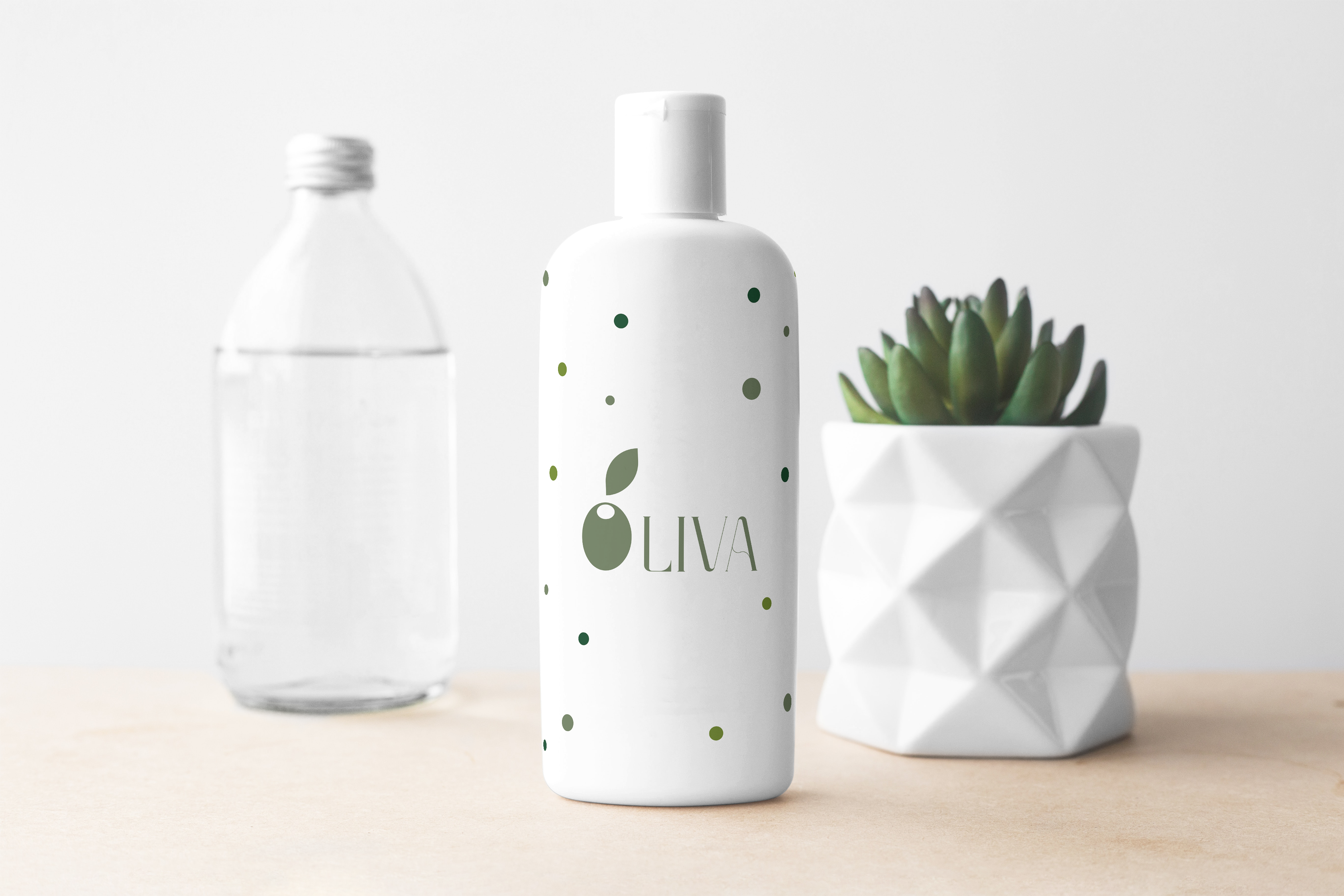
This logo embodies elegance and minimalism, which is perfectly suited for a natural cosmetics brand. The main element of the logo is a stylized image of an olive, featuring organic shapes and soft lines that convey a sense of naturalness and freshness. The olive symbolizes purity, naturalness, and care, emphasizing the high-quality ingredients of the products.
Key design features:
• Color palette: The choice of a soft olive shade highlights the naturalness and organic origin of the product, which is associated with olive oil, often used in cosmetic products.
• Font: The font of the logo “OLIVA” is modern, light, and refined, with smooth transitions in the letters that add aesthetics and create a sense of a premium product.
• Overall concept: The logo harmoniously combines the olive symbol and the text part, creating an overall feeling of lightness and naturalness. It embodies the idea of natural self-care through cosmetic products based on natural ingredients.
The process of creating this logo focused on conveying the key values of the brand: naturalness, quality, and care for the body, using modern design that appeals to the conscious consumer.