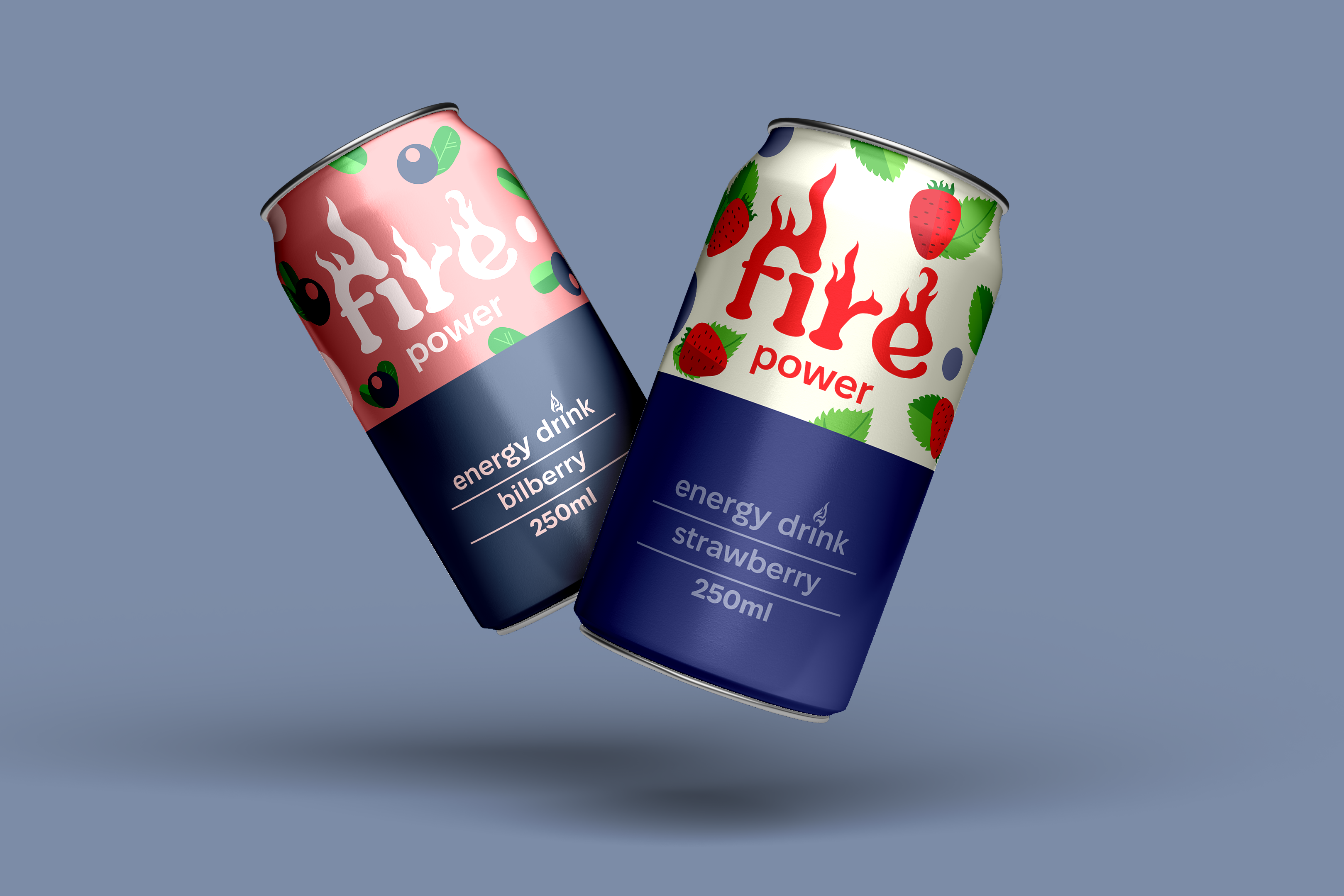
This project presents a design concept for an energy drink that embodies simplicity, strength, and modernity. The main idea is to create a visual image that will instantly attract attention on the store shelf.
Key design features:
• Color palette: Use of colors that correspond to and match a specific fruit, i.e., the flavor of the energy drink.
• Fonts: The inscription "Fire" is designed to look like flames, symbolizing strength, energy, drive, and fire (i.e., desire) to do something.
• Packaging: The design is aimed at a youth audience, active and ambitious people looking for a powerful energy boost. At the same time, the design is simple, and the images of fruits allow consumers to understand which flavor they will choose without having to search long in the ingredients.
Creation process:
Each design element was developed with consideration of modern trends in the energy drink sector, allowing for the creation of a unique product style. The visual part harmoniously combines with the idea of an active lifestyle.