Crypto Industries — conceptual redesign of Instagram
Social Media Page Design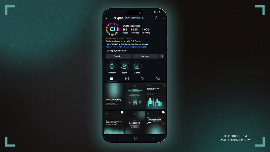
Crypto Industries is a Ukrainian school of crypto trading and investment. The main task of the case is to analyze the existing brand website and adapt its unique identity for social media formats. The goal of the redesign was to create a strict, technological, yet understandable visual system on Instagram that reflects expertise, builds trust in the school, and lowers the entry barrier for potential students.
Design solutions and functional architecture
1. Graphic language and tech interface. The style is based on a deep black background that contrasts with accent turquoise details and brand elements (corner brackets, markers, arrows).
2. Typographic system. A font pair consisting of a heavy, geometric font Unbounded in the headings is used for clear hierarchy, confidently occupying space and being instantly readable while scrolling through the feed, along with the grotesque DM Sans, which ensures perfect readability of the main text blocks.
3. Content strategy one post — one task. Each content unit is designed for a specific business goal. For example, symmetrical certificates create social proof, the visual division of analytical posts into text and graphic levels demonstrates the practicality of the school, and large numbers in statistics (“3000+”) serve as a direct quality marker.
4. Warm-up through carousels and stories. A thoughtful system of multi-page carousels leads the user from pain and emotions in trading to rational problem-solving, turning content into a full-fledged soft sales tool. Stories templates are divided by functions (education, announcements, engagement) but maintain a unified visual code, just like the linear navigation icons of the profile (Highlights).
The conceptual work is done exclusively for the portfolio. It is not official brand material.
#instagram_design #social_media_design
#smm_design #feed_design
Design solutions and functional architecture
1. Graphic language and tech interface. The style is based on a deep black background that contrasts with accent turquoise details and brand elements (corner brackets, markers, arrows).
2. Typographic system. A font pair consisting of a heavy, geometric font Unbounded in the headings is used for clear hierarchy, confidently occupying space and being instantly readable while scrolling through the feed, along with the grotesque DM Sans, which ensures perfect readability of the main text blocks.
3. Content strategy one post — one task. Each content unit is designed for a specific business goal. For example, symmetrical certificates create social proof, the visual division of analytical posts into text and graphic levels demonstrates the practicality of the school, and large numbers in statistics (“3000+”) serve as a direct quality marker.
4. Warm-up through carousels and stories. A thoughtful system of multi-page carousels leads the user from pain and emotions in trading to rational problem-solving, turning content into a full-fledged soft sales tool. Stories templates are divided by functions (education, announcements, engagement) but maintain a unified visual code, just like the linear navigation icons of the profile (Highlights).
The conceptual work is done exclusively for the portfolio. It is not official brand material.
#instagram_design #social_media_design
#smm_design #feed_design