Custom adaptation of Shopify theme for "NY Shelves"
Online Stores & E-commerce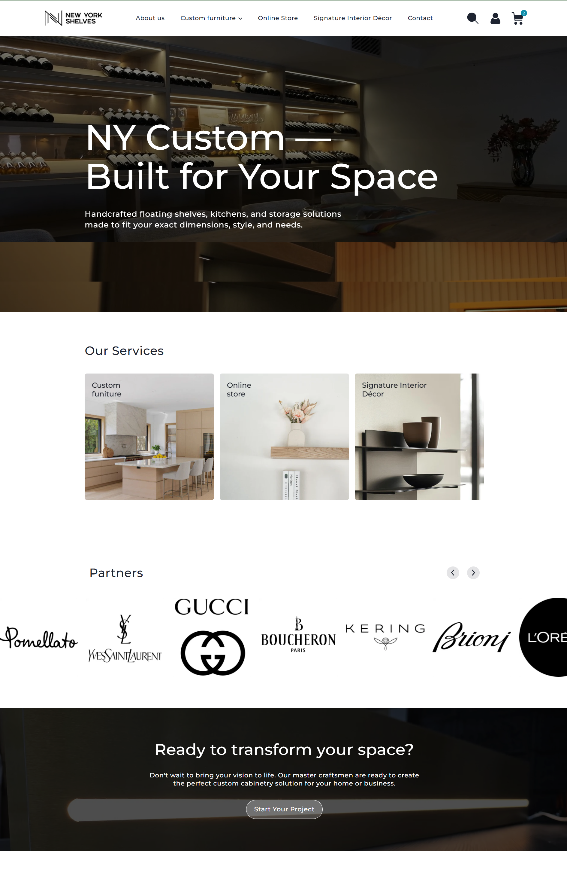
Project link: nyshelves.com
Role: Frontend Developer / Shopify Specialist
Technology stack: Liquid (Shopify), HTML5, CSS3 / SCSS, JavaScript (Vanilla JS)
About the project
"NY Shelves" is a modern online store for stylish interior shelves. The design focuses on minimalism, premium appearance, and high-quality visual content (product cards, galleries).
Project tasks
UI component customization: Create a unique design for key interface elements (site header, product card) that does not fit within the standard settings of the ready-made Shopify theme.
Ideal responsiveness (Mobile-First): Ensure flawless display of the site on smartphones and tablets by optimizing navigation and interactive elements.
Enhancing UX/UI: Simplify the process of selecting product variations and improve interface readability to increase conversion to purchase.
Implemented technical solutions
1. Custom product card (Product Page Layout)
Flexible options grid (Sizes/Chips): Rewrote the standard dropdown logic to a dynamic responsive "chips" grid. On desktop, applied grid-template-columns: repeat(auto-fill, minmax(120px, 1fr)), allowing buttons to automatically distribute across the screen width and correctly wrap long text without overflowing the blocks.
Interactive gallery: Implemented a responsive image slider with the ability to switch via thumbnails and navigation arrows. On the mobile version, set a 1:1 aspect ratio for images to avoid vertical stretching.
2. Header and Multi-level Mobile Menu Optimization
Multi-level navigation structure: Modernized the mobile-drawer (slide-out menu). Added nested Liquid loops to display second-level subcategories (link.links), adjusted proper indents and visual hierarchy, solving the issue of hidden categories on smartphones.
Smart Sticky effect: Fixed the site header at the top of the screen using position: sticky and context isolation (isolation: isolate, z-index), eliminating menu overlap with other custom site blocks during scrolling.
Dynamic cart: Integrated asynchronous updating of the product counter in the cart (cart-badge) by intercepting native Shopify API requests (Fetch API), ensuring instant interface response without page reload.
Results
The site is fully optimized for any screen resolutions: from small smartphones to widescreen monitors.
Resolved the issue with displaying complex and long product modification names — text now wraps correctly, maintaining the overall design aesthetics.
Mobile device users gained full access to the entire catalog thanks to the corrected navigation menu structure.