Design of packaging
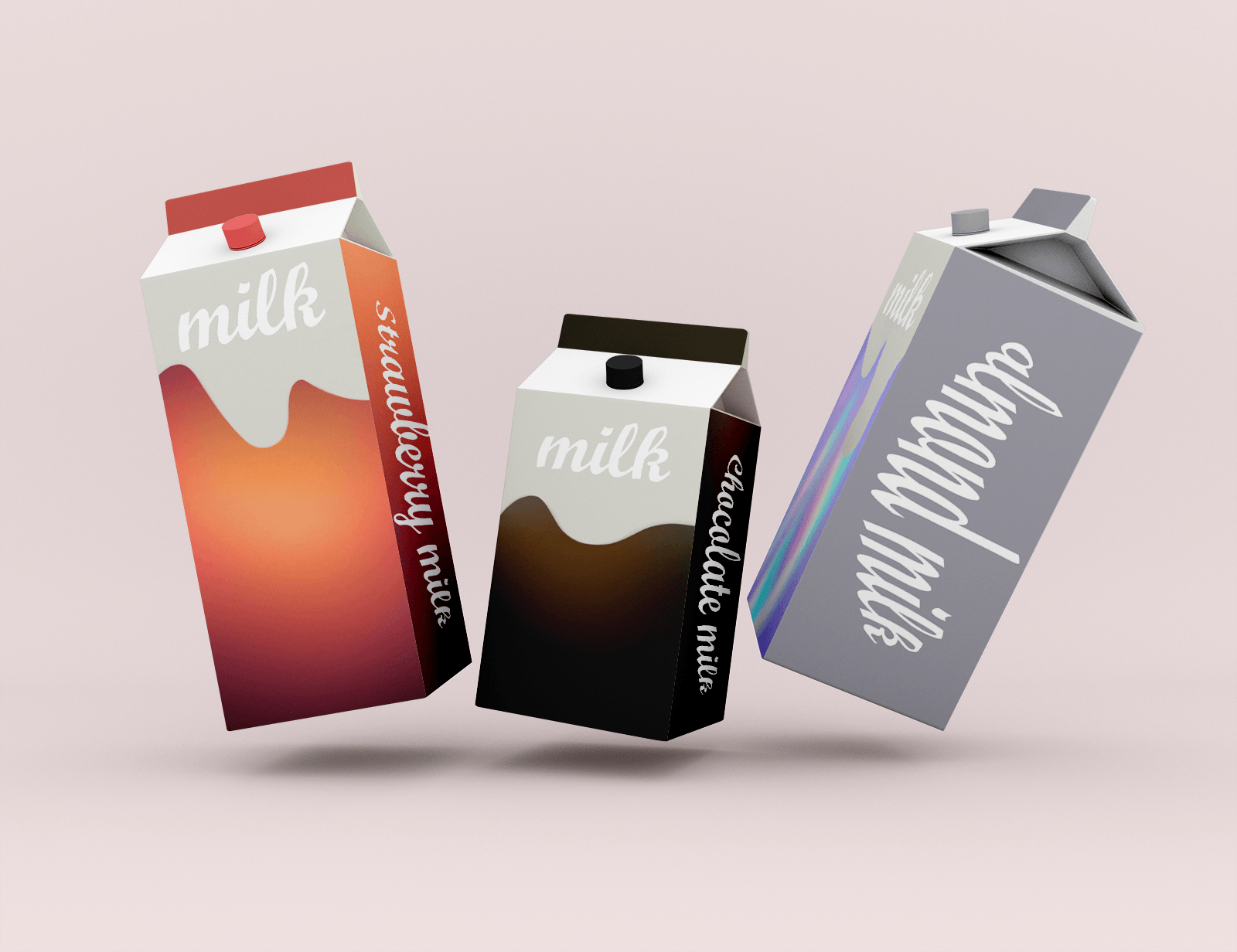
The foundation is taken by an unusual gradient in space motives. To attract the attention of both the adult and the smallest buyer. The gradient is not a widespread course in the design of the packaging, which makes it recognizable among the analogues. They understand the buyer that this milk helps “caps” or “caps”. The decision was to make a transition from the cosmic idea to the Earth’s milk. This move harmonically looks at the pack and becomes recognizable.
#brand
The Identity
by MARCA
The Milk
The Packaging
#product
The visual identity
#brand
The Identity
by MARCA
The Milk
The Packaging
#product
The visual identity
 Kyiv
Kyiv