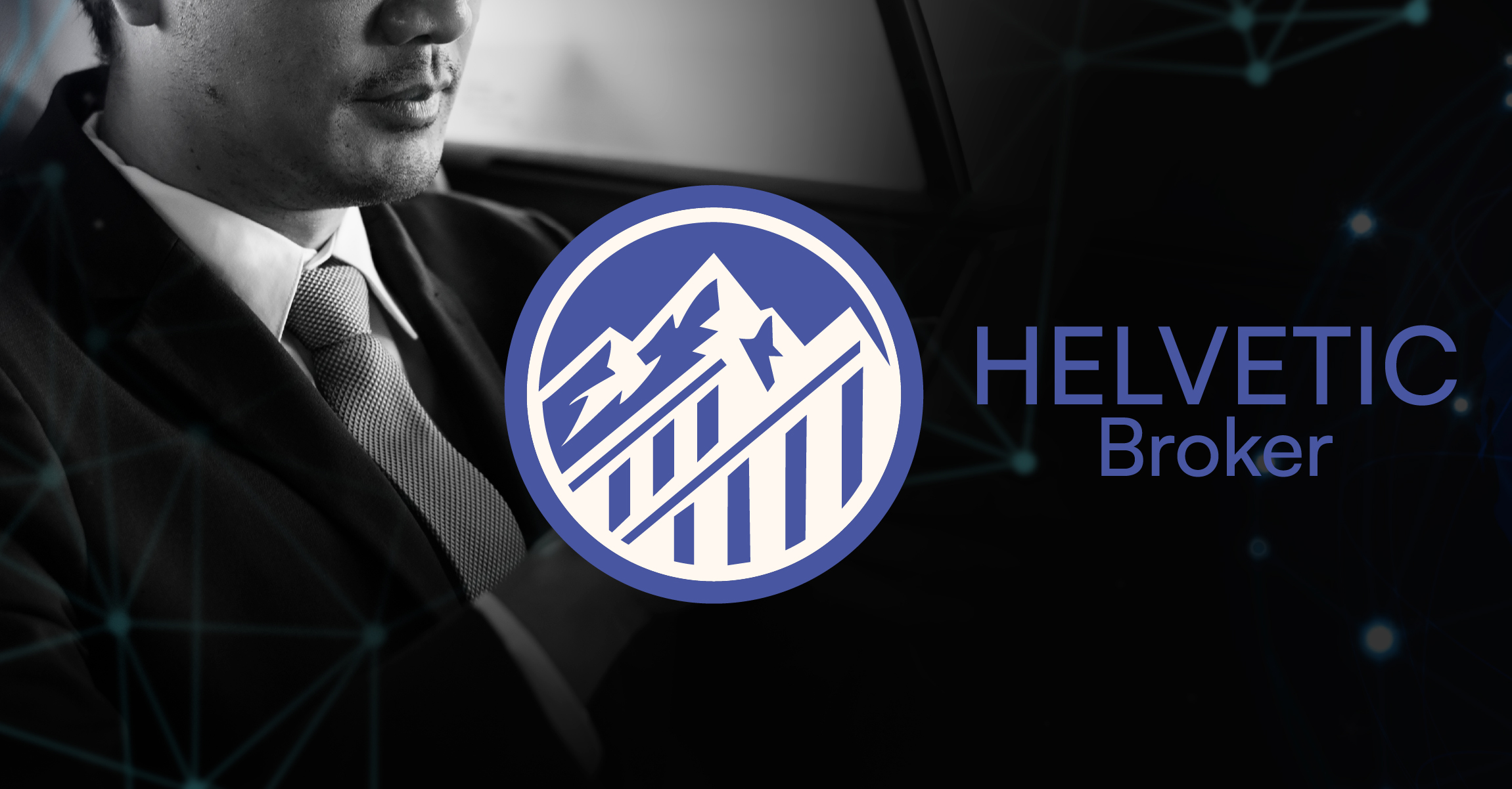
Client: Helvetic Broker – a company specializing in trading stock assets and cryptocurrencies, aimed at experienced investors aged 30-60, predominantly from the middle and upper class.
Task: Create a logo that conveys reliability, strength, and stability associated with the Swiss financial market, while also emphasizing the professionalism of the company. The main goal is to develop a logo that not only looks aesthetically pleasing but also symbolizes the company's values and its focus on continuous growth and achieving high results.
Key design elements:
- Fonts and typography: Use of fonts that convey elegance, modernity, and reliability to build brand recognition.
- Symbolism: Elements associated with Switzerland and finance, including mountains that symbolize strength and stability, as well as abstract forms of the letters "H" and "B" intertwined.
- Key visual metaphors: A mountain as a symbol of financial stability and success, a key as a symbol of access to new opportunities.
Target audience: Experienced investors looking for a reliable broker for investing in stock markets and crypto assets.
Outcome: The expected outcome is a logo that will attract the audience's attention, maintain a professional and sophisticated appearance, and strengthen the company's brand in the financial services market.