Development of the logo for Trinity Group
The form of the logo is based on marine motives. On the one hand, it is a form of wave. On the other hand, a point that resembles the eye indicates the fish. The general description of the image of the logo is a fish jumping out of the water. The accent in the form of eyes, breaking symmetry, creates intrigue, makes the logo brushable and memorable.
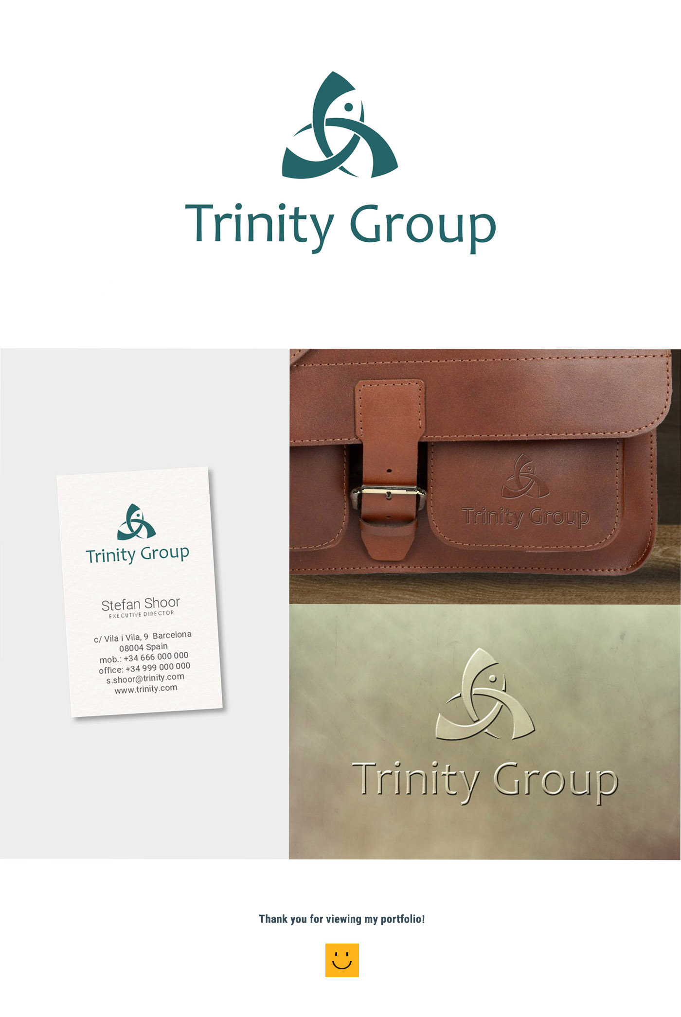
On the visit card, the logo looks dynamic and attracts attention with its vocal expressive form. When applied on the metal, the logo also does not lose its expressivity and dynamism.
The skin logo is harmoniously fit into the general design of the skin product and well supplements it.
On the visit card, the logo looks dynamic and attracts attention with its vocal expressive form. When applied on the metal, the logo also does not lose its expressivity and dynamism.
The skin logo is harmoniously fit into the general design of the skin product and well supplements it.
 Barcelona