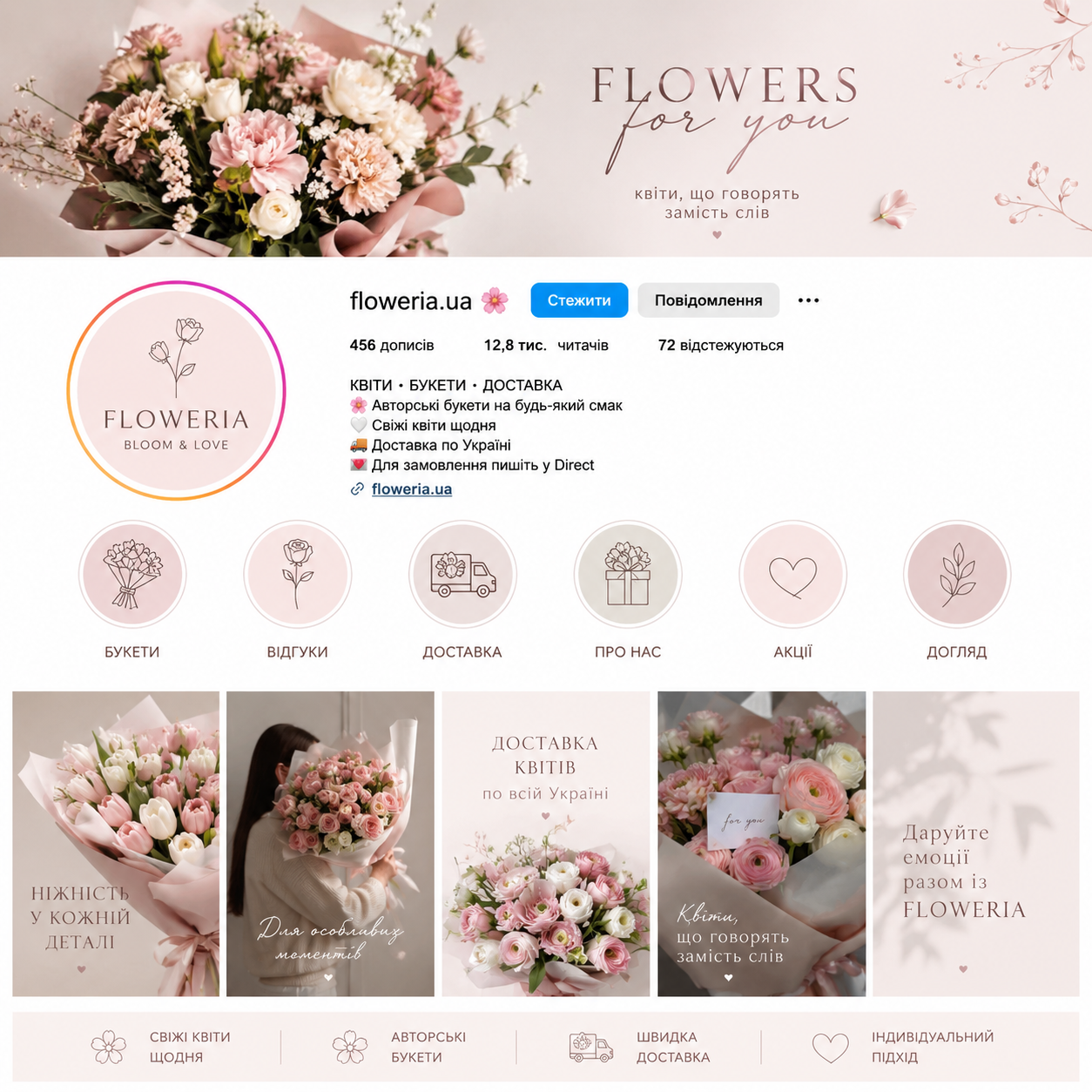
• This layout demonstrates a completely different mood — gentle, emotional, and aesthetic. Color palette: Pastel, powdery, and creamy shades that are associated with tenderness, freshness, and romance. Style: The use of thin lines, concise icons, and soft fonts creates an atmosphere of coziness and care. Structure: The design emphasizes the emotional component ("flowers that speak instead of words", "for special moments"), which is perfect for the floral niche, where the client buys not just flowers, but experiences. Overall conclusion: Both layouts are executed at a high level, adhering to visual branding rules: 1 Unified style: All elements (icons, fonts, photos) are subordinate to the overall brand concept. 2 Functionality: The interfaces are intuitive, allowing users to quickly find the information they need. 3 Marketing effectiveness: The visual line successfully emphasizes positioning: "premium" for watches and "tenderness/emotionality" for flowers.