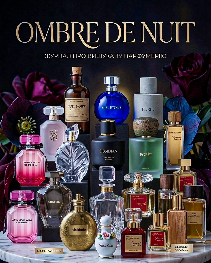
Composition: Instead of a single bottle, we created a professional studio flat lay with a large collection of bottles on a marble table. This creates a sense of abundance in choice and professional expertise of the magazine. Stylistics: The color palette is maintained in deep, evening tones with contrasting accents. Dark, velvet flowers are arranged in the background, emphasizing the drama and depth of the title "Ombre de Nuit" (Shadows of the Night). Typography: The magazine's title is rendered in a large, elegant serif font, giving the cover a classic "glossy" look and status. Details: Bottles of various shapes (from classic rectangular to vintage round) create an interesting visual rhythm. We added recognizable design elements of bottles that reference global bestsellers while maintaining the uniqueness of the composition.