JLY LAB — packaging design
Packaging and label design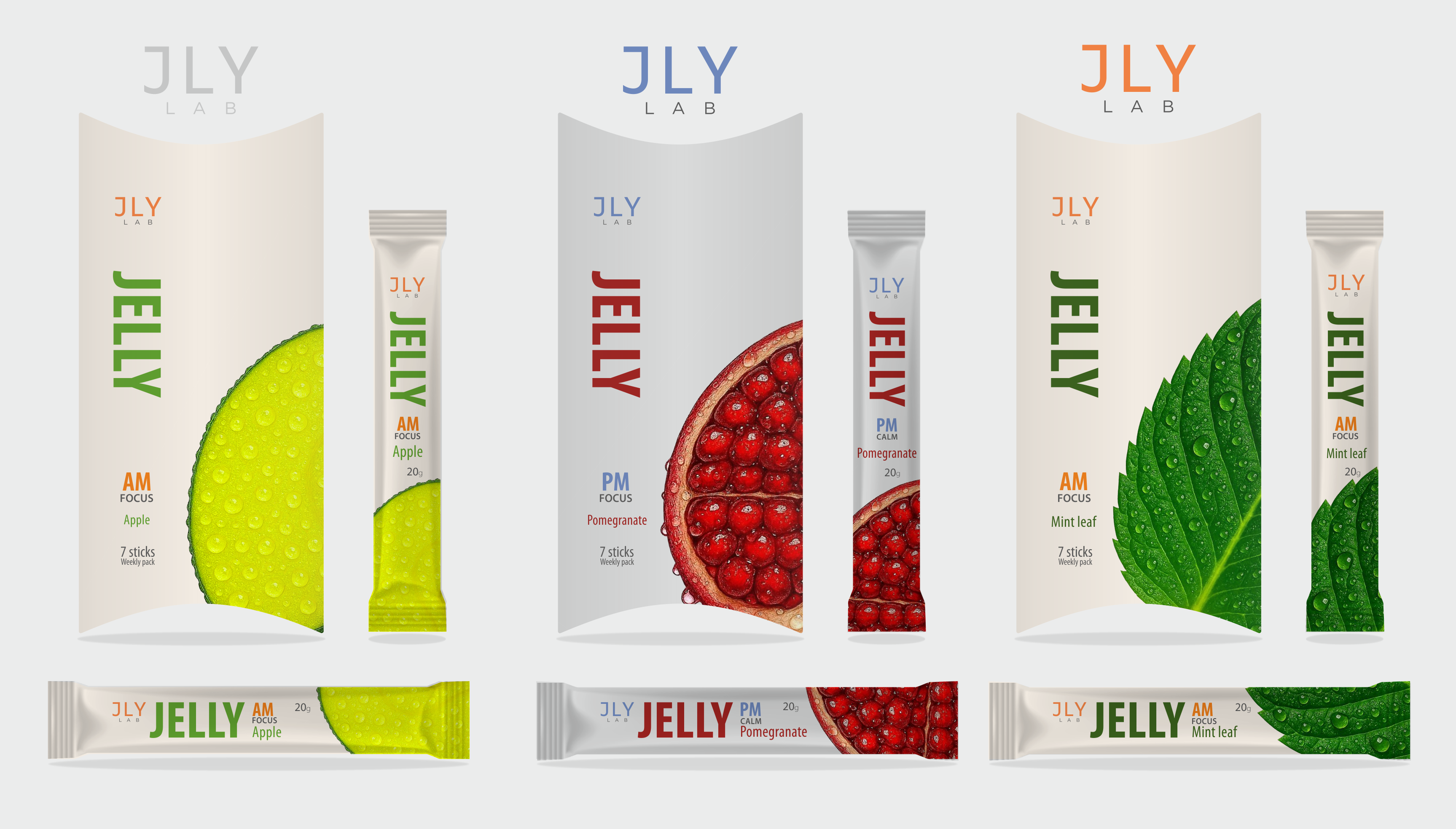
JLY LAB — packaging design for functional jelly stickers
Development of a series of packaging for the JLY LAB product — functional jelly stickers distributed by consumption scenarios (AM / PM). The main task is to create a system that is easily scalable to different flavors while clearly communicating the functional purpose of the product.
The visual concept is built on a combination of minimalism and tactility. A clean light field serves as a "laboratory" background, enhancing trust in the product, while large macro images of ingredients add naturalness and appetizing appeal.
The color system addresses two tasks at once:
— differentiation of flavors (apple, pomegranate, mint)
— delineation of usage scenarios (AM — energy and focus, PM — calm)
The typography is simple and functional: emphasis on the word JELLY as the key product, without overloading with unnecessary decorative elements. The information hierarchy allows for quick reading of the product even in stick format.
The solution is easily adaptable to new SKUs — the ingredient, color, and functional marker change, while maintaining brand integrity.
The result is packaging that looks like a systematic product, not a random assortment of flavors: clean, clear, and commercially viable for the shelf.
#packaging_design #packaging #fmcg #food_design
#branding #identity #product_design