MILL BREWS
Packaging and label design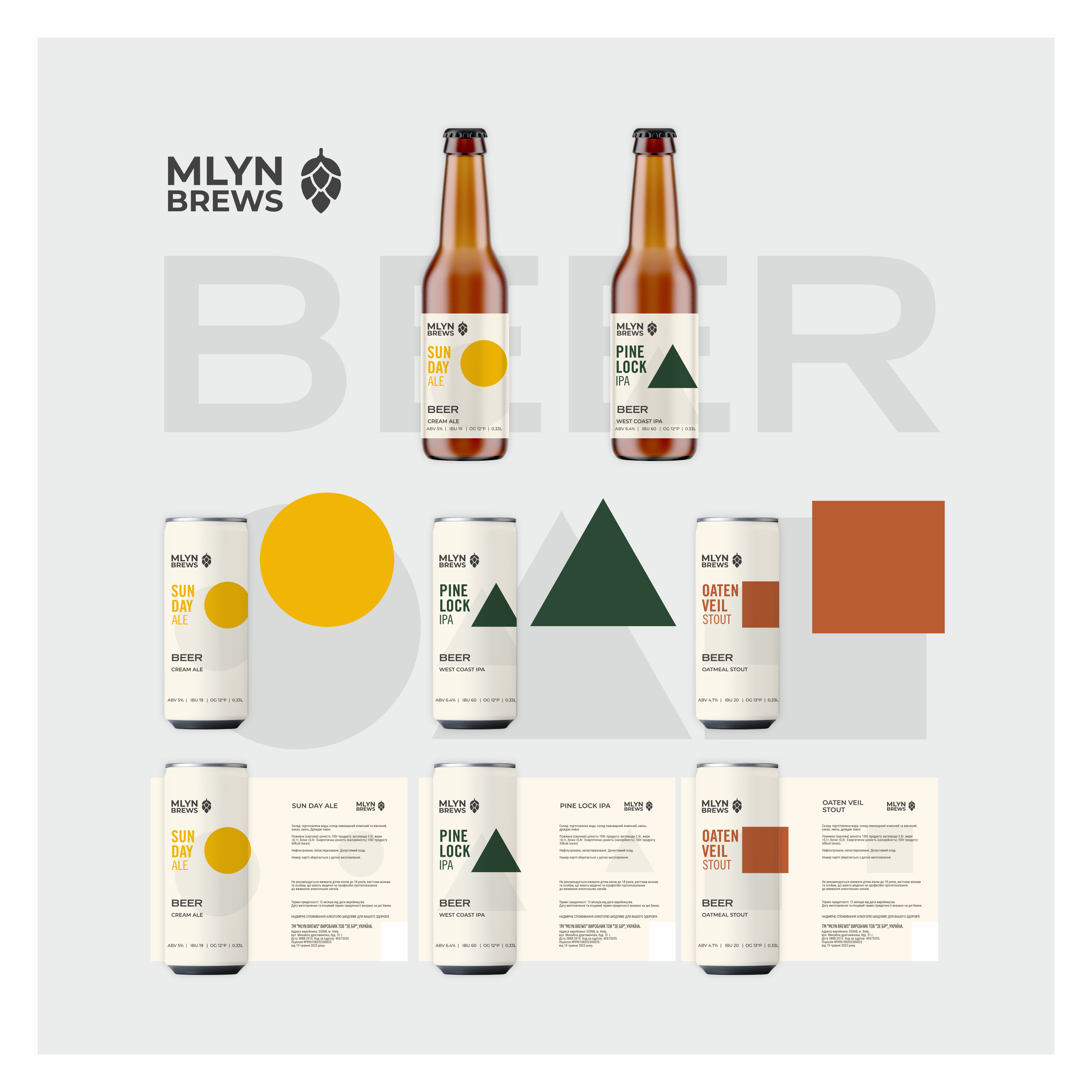
The series of labels for MLYN BREWS is based on the principle of a flavor graphic code — where each variety has a simple, recognizable sign that works faster than text. Instead of overloaded illustrations — a clean system: shape + color = flavor profile.
• SUN DAY ALE (Cream Ale) — circle
A warm yellow sign associated with the sun, lightness, and drinkability. Visually conveys a refreshing character and “summer” simplicity of style.
• PINE LOCK IPA (West Coast IPA) — triangle
A rigid, pointed shape with a deep green color. Refers to hop bitterness, pine, and resinous notes. The geometry enhances the feeling of clarity and a “dry” finish.
• VEIL OATEN STOUT (Oatmeal Stout) — square
A stable, massive shape with a warm brown hue. Visually speaks of density, softness, and the creamy texture of oatmeal stout. The entire system works as a unified visual alphabet, where: shape = character color = taste scale = accent
This allows for easy scaling of the line without losing recognizability and not relying on narrative illustrations.
The minimalist approach deliberately contrasts with typical “overloaded craft,” leaving only what truly works on the shelf — quick reading and clear differentiation.
#packagingdesign #beerlabel #craftbeer #minimaldesign #branding #graphicdesign #labeldesign #visualidentity #beerpkg #modernbranding #logodesign