Kvituchi
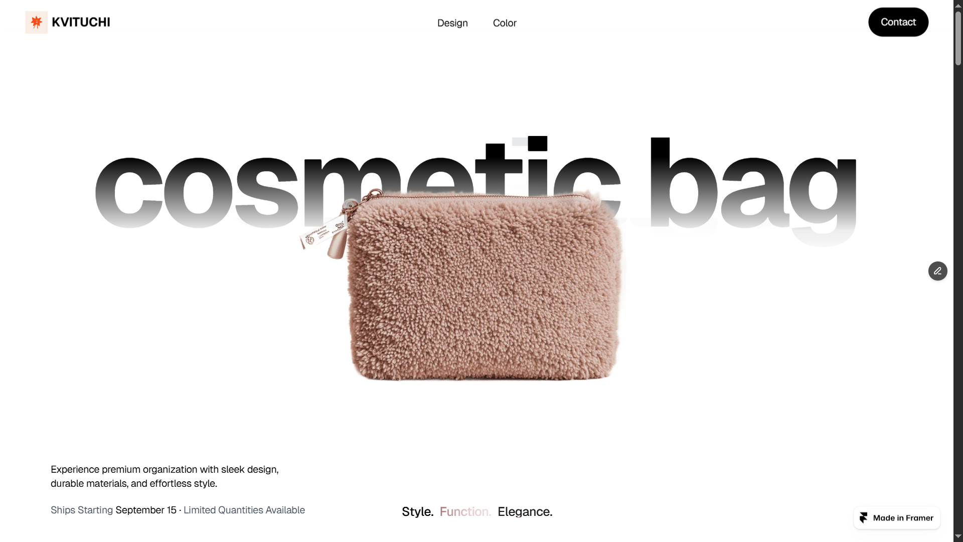
Kvituchi — a conceptual landing page for presenting a new exclusive product in the store - a designer cosmetic bag. The main idea is to create a stylish, modern, and emotional digital space that emphasizes the uniqueness of the product and creates a sense of desirability even before the purchase.
The website is developed as a product landing page, focusing on one product and revealing its value through visuals, composition, and the proper presentation of advantages.
Project goals:
- Present the new exclusive cosmetic bag as a premium product;
- Create a strong first visual image of the product;
- Highlight the style, functionality, and uniqueness of the design;
- Build a logical user journey from product introduction to purchase interest;
- Create an emotional connection between the brand and the audience.
UX/UI approach:
- Focus on one product. Minimum distracting elements, maximum attention to the product.
- Clear structure: presentation - advantages - details - call to action.
- Visual hierarchy that gradually reveals the product's value.
- Thoughtful placement of CTA blocks to stimulate interaction.
- Balance between aesthetics and commercial effectiveness.
- The user goes through a logical scenario: first emotional excitement, then rational confirmation of the product's value.
Design concept:
1. Style - modern minimalism with a commercial emphasis.
2. Color palette emphasizes the exclusivity and sophistication of the product.
3. Large visual blocks with the product create a "showcase" effect — the cosmetic bag becomes the central hero of the page.
4. Typography is selected to look stylish, modern, and readable.
The design is built on the principle of "less is better," so attention is fully concentrated on the new product.
Technical implementation:
- Platform: Framer
- Fully responsive layout (desktop/tablet/mobile)
- Optimized structure of a single-page website
- Customized interactive elements
- Loading speed optimization
- Basic SEO structure
The website maintains aesthetics and functionality across all device types. The project demonstrates how a well-designed product can appear more expensive and desirable due to UX/UI solutions.
Work results:
- A stylish product landing page has been created
- The premium and exclusivity of the new product has been emphasized
- A logical user interaction scenario has been built
- Responsive design has been implemented
- The website is ready to be used as a launch page for the new product
The project is created as a conceptual site for demonstrating the launch of a new product. Visual materials are used for demonstration purposes. Design, structure, UX/UI solutions, and implementation are original work.
 Dnepr
Dnepr