Label redesign
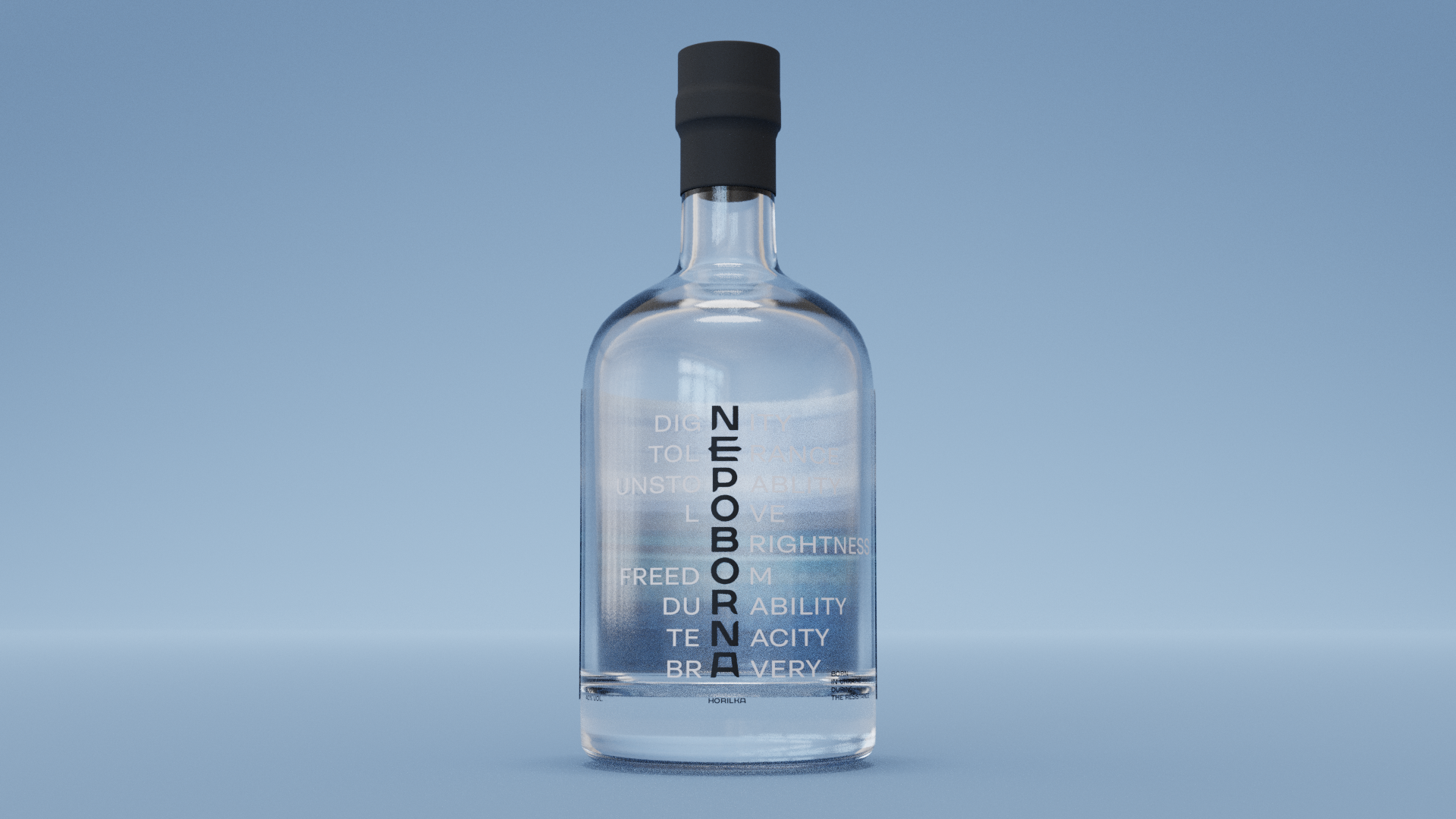
Brief: to rebrand the label for the famous Nepoborna spirits band, retaining its recognizability but moving away from the old design that risked losing its relevance. In the course of the work, it was decided to keep the background of the sea to remind us of the old meaning, but to include a new, timeless. The client initially chose the above mentioned concept among the presented ones, but it was not implemented. The idea was to emphasize the convergence of us as a nation and to convey the meaning of invincibility. In this way, we can see how invincibility is made up of different traits and manifestations of our people, as if in pieces.
 Kyiv
Kyiv