layout according to the Figma mockup
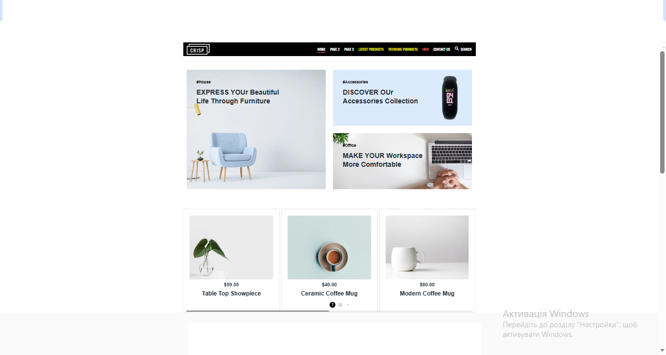
A little information about this layout. There are three pages, a fixed header, and the menu items lead to other pages. The yellow menu items lead to certain sections on the page (smooth scroll). There are also submenus that appear when hovering over certain menu items ("contact us" and "search" in this case). In the mobile version, they open by clicking the arrow. You can close them by clicking the arrow or anywhere on the screen outside the submenu itself.
There is a swiper on the page. The settings for automatic slide scrolling are enabled until the user intervenes and starts flipping through the slides themselves. In the desktop version, this can be done using the cursor, mouse, or keyboard.
The links to products do not lead anywhere, as this is just a sample.
There are various hover effects on objects and animations - appearing while scrolling.
 Kyiv
Kyiv  Available for hire