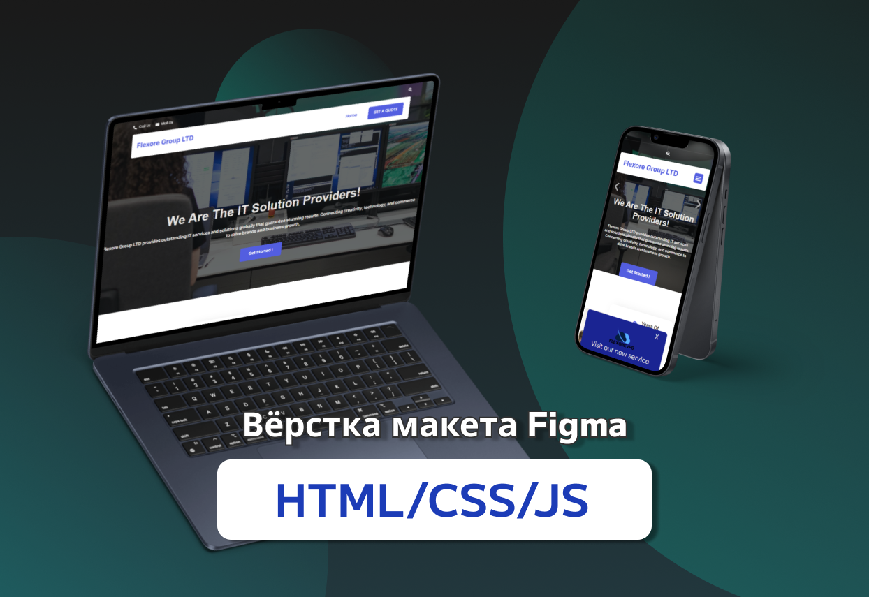
Layout of the design from Figma
Project General Characteristics:
- The layout is designed using a responsive approach, ensuring correct display on devices with different resolutions.
- The Bootstrap framework is used for structuring and simplifying development.
- GULP is used as a task manager for automating tasks, including SCSS compilation, file minification, image optimization, and running a local server.
- The main style is described using SCSS, which allowed for efficient code organization using variables, mixins, and nesting.
Project Structure:
- HTML files are structured with semantic tags (header, main, section, footer, etc.) to improve readability and SEO.
- The file structure is organized according to the BEM (Block Element Modifier) principle, which simplifies project maintenance and scalability.
- Bootstrap is connected and customized through SCSS, allowing the use of Bootstrap variables for style adjustments.
Layout Features:
- Grid: The standard 12-column Bootstrap grid is used for content layout. The grid system is adapted for the layout.
- Typography: Fonts are connected through Google Fonts or other services, and the styling of text elements is configured through SCSS (using variables and mixins).
- Modular Styles: Each component (e.g., buttons, cards, forms) has a separate SCSS file. All styles are imported into a common main.scss file, which compiles into CSS.
- Variables: A _variables.scss file is created to manage the color palette, fonts, and other global parameters.
GULP Functionality:
- Automated:
- - SCSS compilation to CSS.
- - Minification of CSS, HTML, and JS.
- - Image optimization (lossless compression).
- - Real-time browser updating via BrowserSync.
- A watch script is set up to monitor changes in files and automatically rebuild the project.
Responsiveness Features:
- Media queries are used in SCSS to adapt styles for different screen resolutions. The main breakpoints are based on Bootstrap Breakpoints.
 Kyiv
Kyiv  Available for hire
 Offer work