Logo for a dating mobile application, 2nd option
Logo Design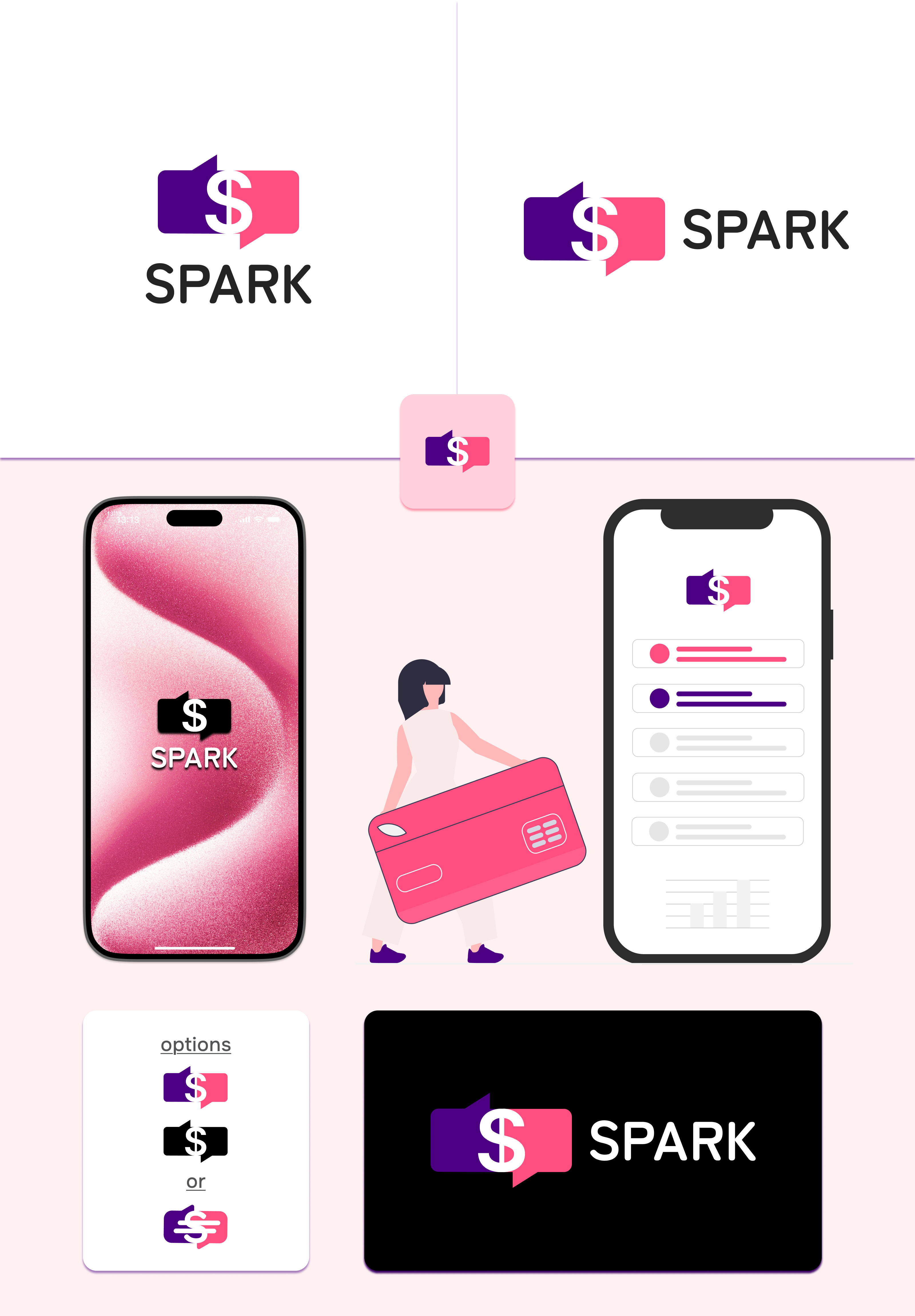
Idea:
This logo conveys the concept of the dating platform SPARK, where communication and earning opportunities are combined. The main emphasis is on the $ symbol, highlighting the financial motivation that sets the service apart from competitors.
Graphic element:
Two dialogue boxes (chats), positioned opposite each other, symbolize communication between people — between a man and a woman.
The left part is dark purple (trust, depth, technological)
The right part is bright pink (emotionality, attractiveness, flirting)
In the center, there is a white dollar sign ($), which connects both boxes, indicating the relationship between communication and the financial reward users can receive. #Logo #logotype #minimalism #Branding #logo design #logotype #corporate style