Logo for a mobile dating app 3 options
Logo idea:
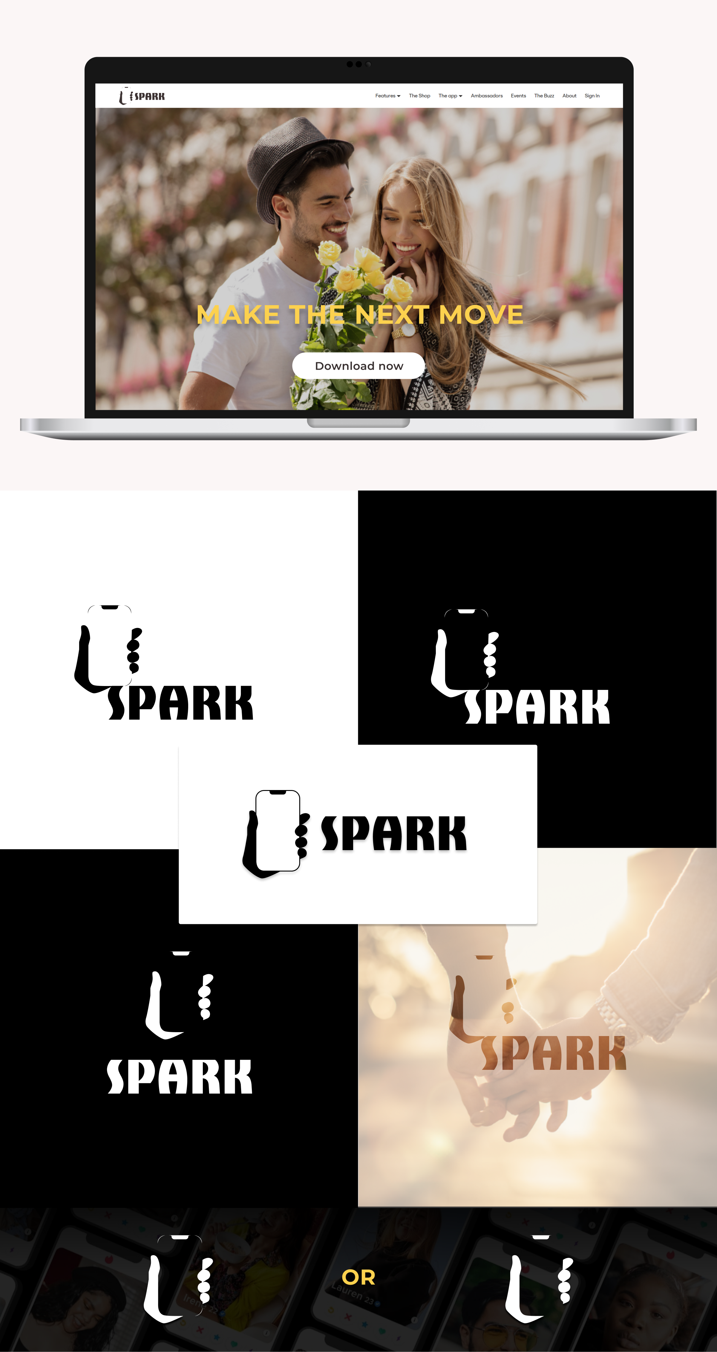
The logo conveys the idea of mobile communication, trust, and ease of meeting through the app. By using negative space, it creates an impression of modernity, minimalism, and visual intelligence, emphasizing the accessibility of the service on mobile devices.
The main element is a silhouette of a stylized hand. Inside this silhouette, thanks to negative space, the shape of a mobile phone is clearly visible. This creates a strong visual contrast and makes the image dynamic. The three dots on the "fingers" of the hand add details and can symbolize a "spark" of interaction or simplicity of the interface.
#Logo #logotype #minimalism #Branding #logo design #logotype #corporate style #Figma
 Reshetilovka