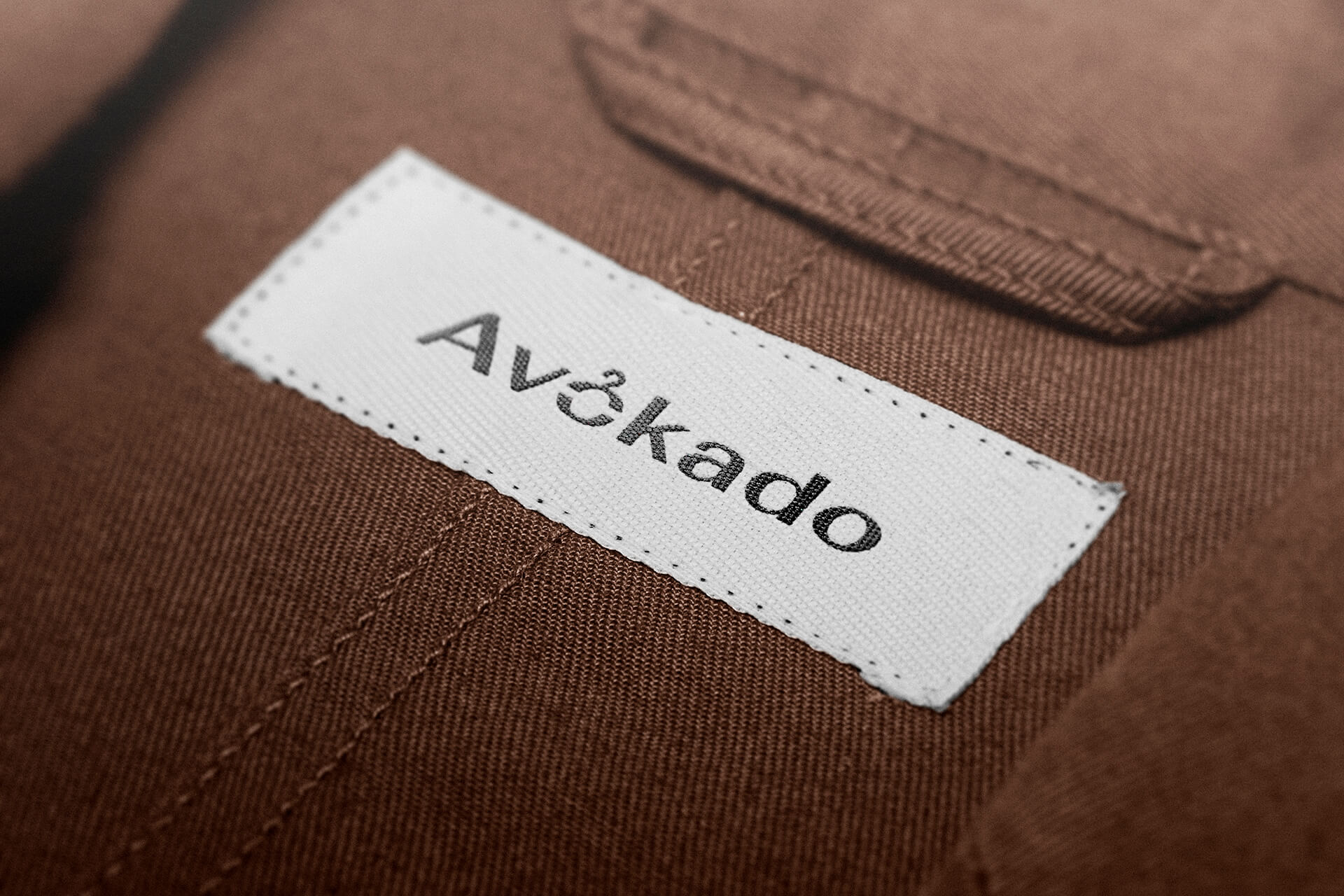
Logo for the clothing store “Avokado”
Logo for the clothing store “Avokado”.
The company is selling clothes for children and adolescents.
The task:
Reflect the company’s activities through a logo in a minimalist or abstract style.
The Decision:
• A contrast font with a different thickness of lines has been selected, which gives the logo more game masses.
The letter "O" consists of two parts, where the superstructure is performed in the form of a wire. This thread gives the logo more attitude to the company’s activities.
As a result, the logo became easy to read and remember.
#Company #branding #logo #design #firmenstyle #shop #branding#marking #logotypes #brand #wear #identity #logodesign #style #moving #business #marketing #positioning #freelance #presentation #for children
 Almaty (Alma-Ata)