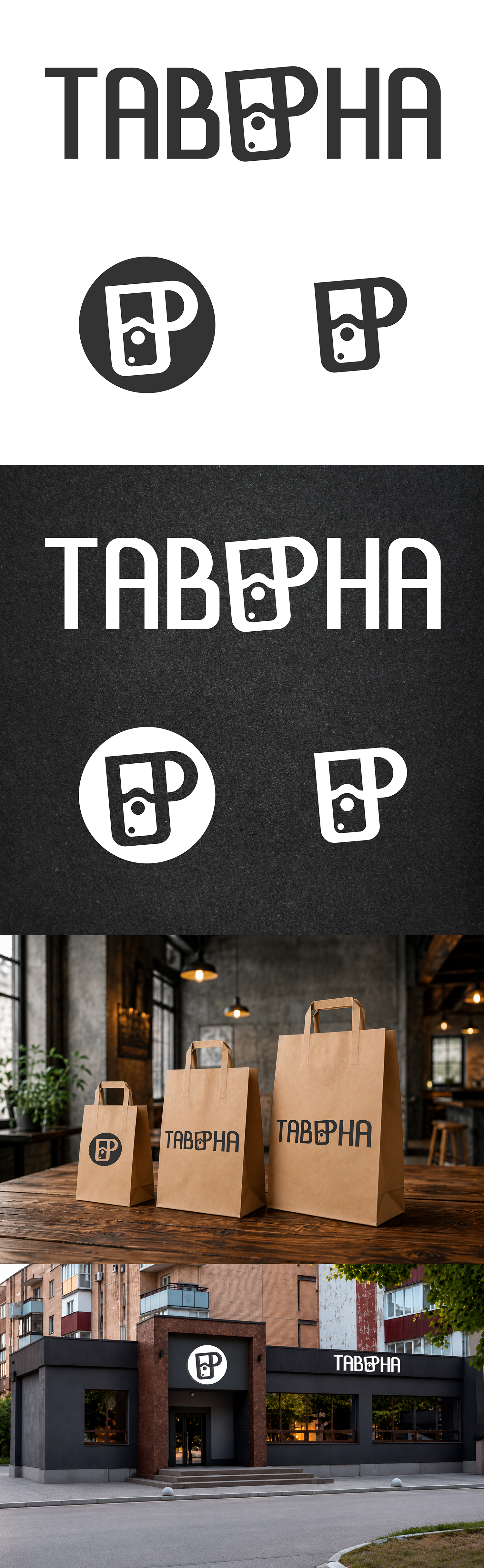
"The Tavern" is a café-bar where you can not only enjoy delicious snacks but also taste a wide range of rare and exquisite beer varieties. This feature of the establishment became the foundation of the logo concept.
The main task was to find a balance between the cozy café atmosphere and a venue associated with quality beer. The logo was to subtly emphasize the beer theme while not looking like a typical bar or pub sign. Therefore, restrained minimalism with a slight nod to the aesthetics of ancient taverns was chosen as the basis.
The name of the establishment is executed in a font with a character reminiscent of old signs. The central element of the composition consists of the letters "E" and "R," which together form a single graphic symbol. At the same time, this symbol is easily read as a glass of foamy beer, immediately conveying the main direction of the establishment's activities.
To add character to the logo, the glass has a slight tilt. This small detail creates a sense of movement, lightness, and a friendly atmosphere. At the same time, the tilt does not disrupt the overall restraint of the sign and does not make it too "loud."
Particular attention was paid to versatility. The graphic symbol works wonderfully as a standalone element and is easily recognizable even without the text part of the logo. Thanks to its simple geometry, it looks equally good in light and dark versions, is easily readable in small sizes, and adapts well for signs, packaging, avatars, stickers, and other branded products. #logo #logotype #Logos #vectorgraphics #favicon #vector #Logos
The main task was to find a balance between the cozy café atmosphere and a venue associated with quality beer. The logo was to subtly emphasize the beer theme while not looking like a typical bar or pub sign. Therefore, restrained minimalism with a slight nod to the aesthetics of ancient taverns was chosen as the basis.
The name of the establishment is executed in a font with a character reminiscent of old signs. The central element of the composition consists of the letters "E" and "R," which together form a single graphic symbol. At the same time, this symbol is easily read as a glass of foamy beer, immediately conveying the main direction of the establishment's activities.
To add character to the logo, the glass has a slight tilt. This small detail creates a sense of movement, lightness, and a friendly atmosphere. At the same time, the tilt does not disrupt the overall restraint of the sign and does not make it too "loud."
Particular attention was paid to versatility. The graphic symbol works wonderfully as a standalone element and is easily recognizable even without the text part of the logo. Thanks to its simple geometry, it looks equally good in light and dark versions, is easily readable in small sizes, and adapts well for signs, packaging, avatars, stickers, and other branded products. #logo #logotype #Logos #vectorgraphics #favicon #vector #Logos