Logotype
The task is to develop a logo and company style for business, which creates desktop sets of manual robots.
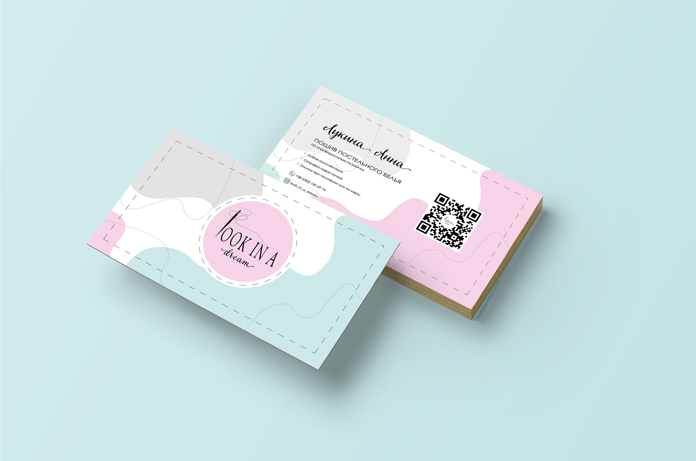
The foundation of the logo was taken by the graphic sign "golk" - a symbol of the art of the shedding in combination with the font. There was also the design of the firm pattern, on the basis of which the colors were taken, which harmonize with the logo. The shell symbolizes the dressing line.
Based on the company style, a visit card is designed and placed on the mocap.
 Irpen
Irpen