MSL Logo
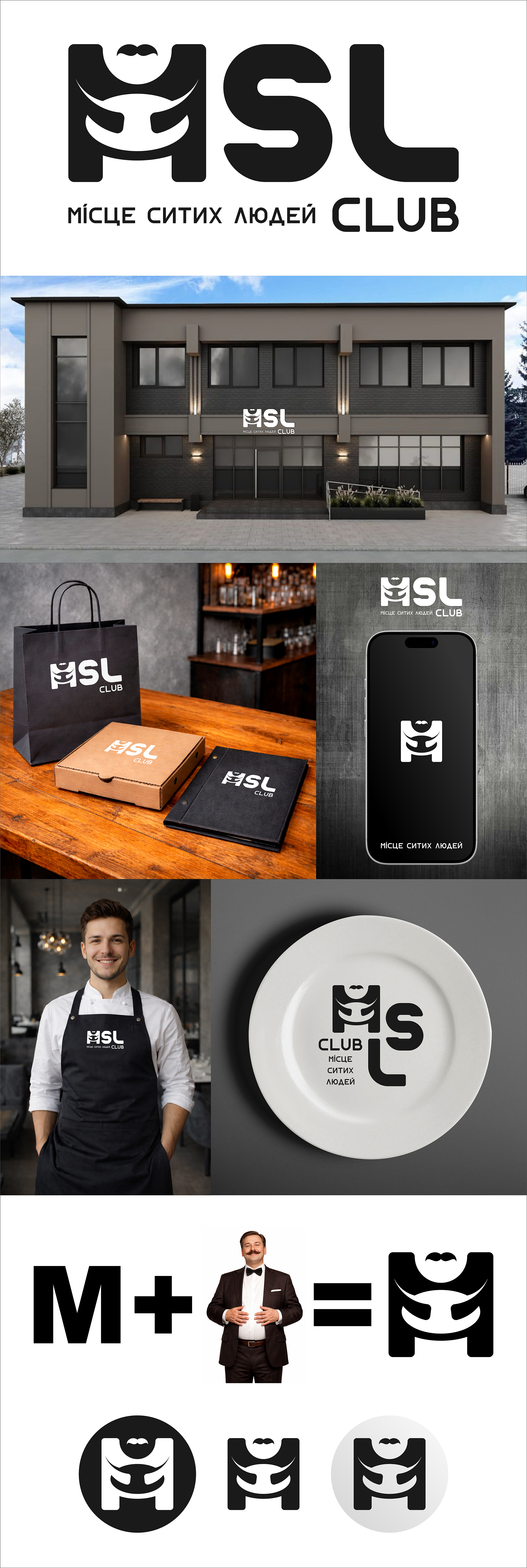
Logo option for the competition. Did not win, but I will leave it here. I don't know why, I just personally like this logo. My version is youthful, clear, without unnecessary details. With a light club note, but without excessive bending. After all, this is a family food establishment, so I tried to maintain a touch of interest and a light club vibe. To keep it understandable and welcoming for the surroundings. The main three letters are full, thick, with rounded shapes - they enhance the idea of fullness and satisfaction. The complementary font is classic, sans-serif, which emphasizes the sophistication and status of the establishment. The letter M is an independent logo. The concept is simple and clear - the sign combines three words from the name: M = place Hands holding a full, stuffed belly = fullness The overall silhouette of a man with a mustache and a smile = person As a result, we have the idea: Place of Full People. The mustache is a small but important feature. A subtle hint at the already existing logo and a connection to the cheerful chef. The sign reads well in any size and color. It works great as an icon and does not lose its expressiveness even when reduced. Development cost: 2 cups of tea, breakfast, lunch, dinner. And a large pack of Lays chips))) #logo #logotype #Logos #vectorgraphics #favicon #vector #Logos #agronomy
 Zolotonosha