Packaging for the drip coffee brand
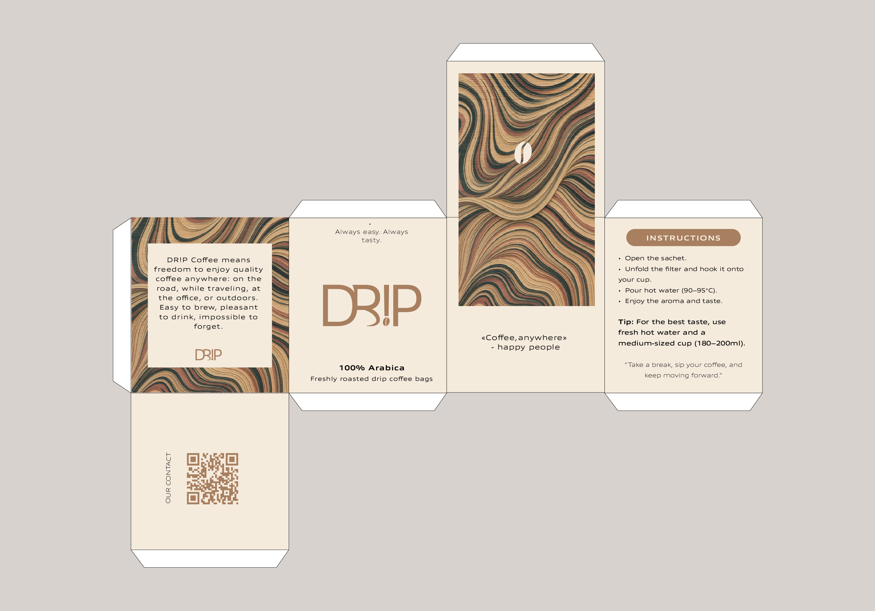
The packaging is designed as an extension of the brand identity of drip coffee, combining minimalism, naturalness, and the warm aesthetics of the morning ritual. The design conveys a sense of calm and balance, making the moment of brewing coffee a small element of aesthetic pleasure.
The main focus is on clean forms and a harmonious color palette inspired by the shades of coffee beans, milk, and clouds of steam. The space and lightness in the composition emphasize the freshness of the product, while the concise typography gives the design recognizability and a modern sound.
The packaging is created in several variations for different coffee varieties. Each of them has its own color accent, which helps to easily navigate among the brand's products while maintaining the visual integrity of the collection.
#packaging #branding #identity #coffeebrand #graphicdesign #packaging #branding #dripcoffee #visualidentity #coffeepackaging
 Rzeszw