Product card infographic
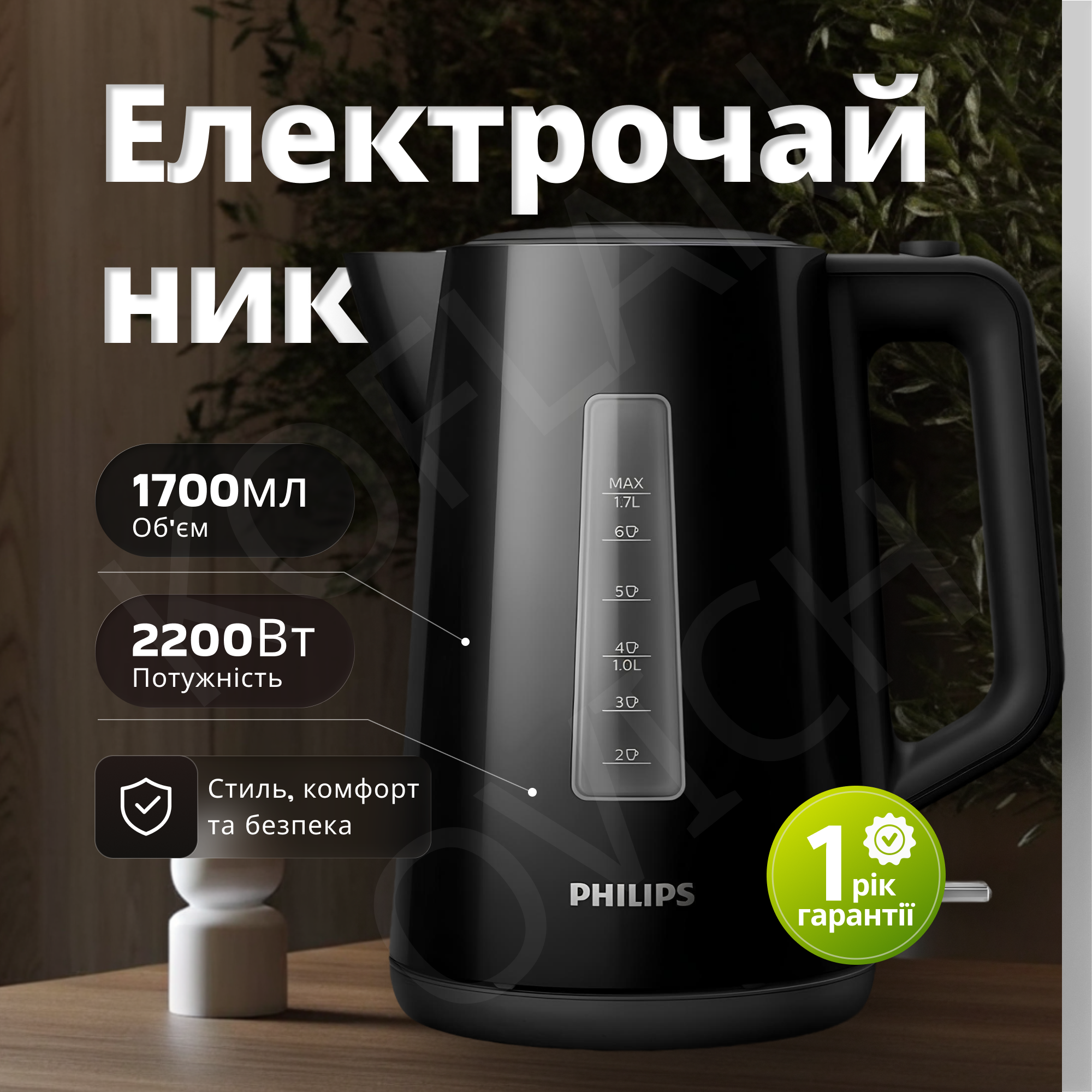
I am developing infographics and a decision map for your client. In this layout, I used: Hierarchy of text: a large headline grabs attention, and bullets explain the benefit. Contrasting color accents guarantee focus on the safety of the purchase. Thoughtful composition: the product occupies 70% of the space, allowing for details to be examined without unnecessary zooming. The result is a card that professionally addresses all the buyer's questions even before they ask them #infographic-amazon
 Kyiv
Kyiv