Redesign of site
The task:
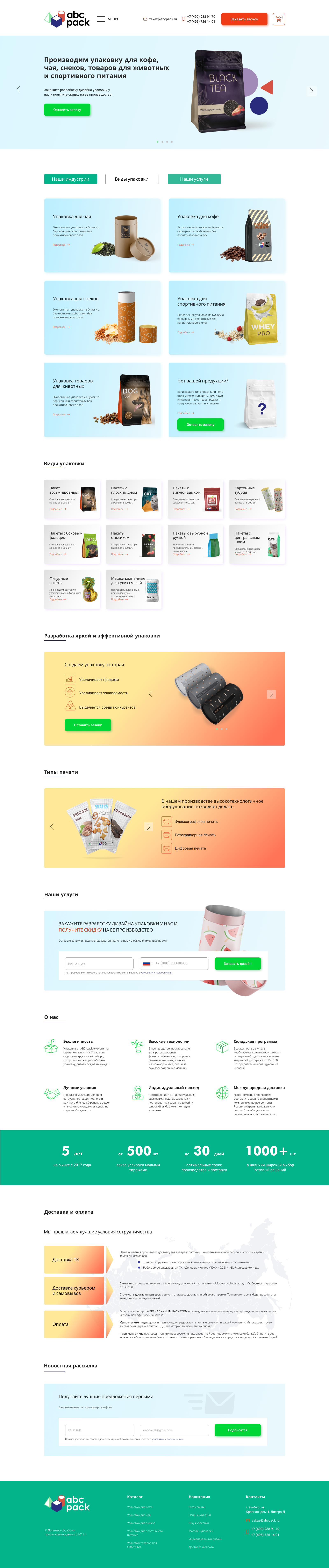
The company is engaged in developing packaging for food and industrial purposes. The existing site design was not user-comfortable, the UI/UX components are obsolete, not functional and not presentable.
The Decision:
On the basis of the information provided, a re-design of the site has been developed, a clear and understandable structure has been made for the user. Echo in people is associated with safety and purity, so the colors are chosen green (green), blue (clean, sky) and a little red orange for bright accents in design.
Adaptive design was also developed for mobile and tablet devices.
 Kyiv
Kyiv