RioBeauty | brand identity
Corporate Style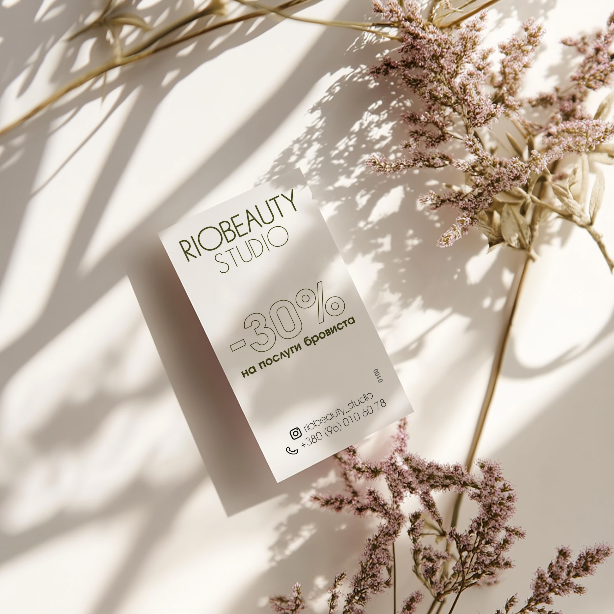
branding
The branding project began with a unique source of inspiration – a cockatiel named Rio, who became the studio’s mascot. Rio’s playful and bright character inspired the brand identity, embodying themes of lightness and freedom.
Concept development:
The initial logo design was inspired by the animated film “Rio”, focusing on the bird’s distinctive crest. This element was used to symbolize elegance and individuality, while remaining true to the studio’s creative essence.
Color palette selection:
The color palette was carefully selected taking into account the client’s preferences, focusing on a sophisticated khaki tone and complementary shades. Light and airy colors were selected, which were in line with the minimalist approach to design and the brand’s theme of freedom and creativity.
Typography and Style:
Sans-serif fonts were chosen for their clean, modern look, which perfectly matched the minimalist aesthetic of the project. The typography emphasized simplicity and clarity, emphasizing the accessibility and innovation of the brand.
Logo Design:
The final logo featured a square layout with the word “Rio” as the central point. Special attention was paid to the letter “o”, where a thin feather was seamlessly integrated, creating a playful yet elegant connection to the cockatiel. This design emphasized the uniqueness of the brand, while maintaining a professional and minimalist feel.
Thanks to thoughtful design decisions and attention to detail, the branding successfully captured the spirit of Rio, the cockatiel, and also matched the client’s vision for a stylish and meaningful identity.
#midjourney #beauty #Guideline #logotype #businesscard