TOWER platform — visual identity for the veterans' project
Development of visual identity for a veterans' platform dedicated to the memory of a fallen soldier with the call sign "Tower". The project has a deep emotional component, so the design was created with special attention to symbolism, inclusivity, and aesthetic integrity.
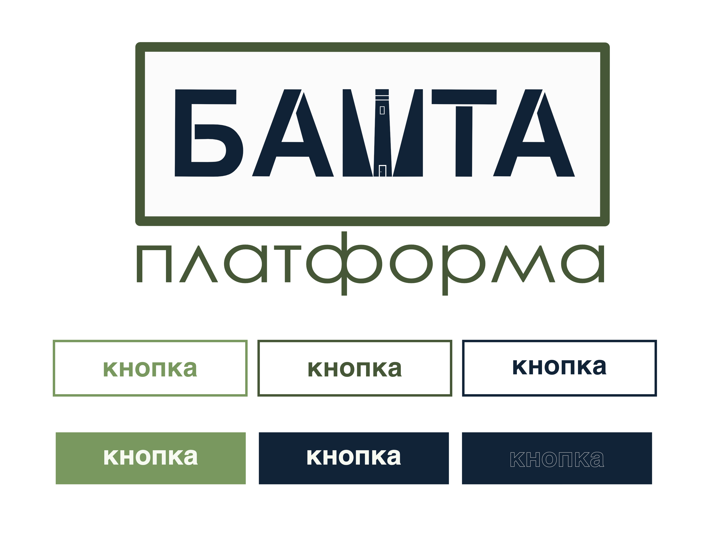
Logo and typography:
The main element is the name "TOWER", executed in dark blue, symbolizing dignity, strength, and stability.
The central letter "Ш" is stylized in the form of a tower — as a visual memorial honoring the personal story of the hero.
The lower element is the word "platform", executed in a soft green color, adding balance, openness, and a modern sound.
Inclusivity and accessibility:
The color palette is selected according to the principles of inclusive design — taking into account contrast, emotional perception, and convenience for users with various visual impairments. This ensures comfortable visual perception and an emotional connection with the brand.
Digital adaptation:
Based on the logo, a set of graphic materials for social media has been developed:
templates for posts
banners for pages
avatars and covers
This allows for maintaining a cohesive visual communication of the brand in the online environment.
Project value:
This design combines a deep story, emotional sensitivity, and a professional approach to branding. It is not only visually appealing but also serves an important social function — preserving memory, uniting the community, and building trust.
 Klaipeda