WEB STUDIO
The website features a page for the creative agency "WEB STUDIO" which offers web design and development services. The main focus is on responsive design, allowing the site to display correctly on any device.
Main Elements of the Website:
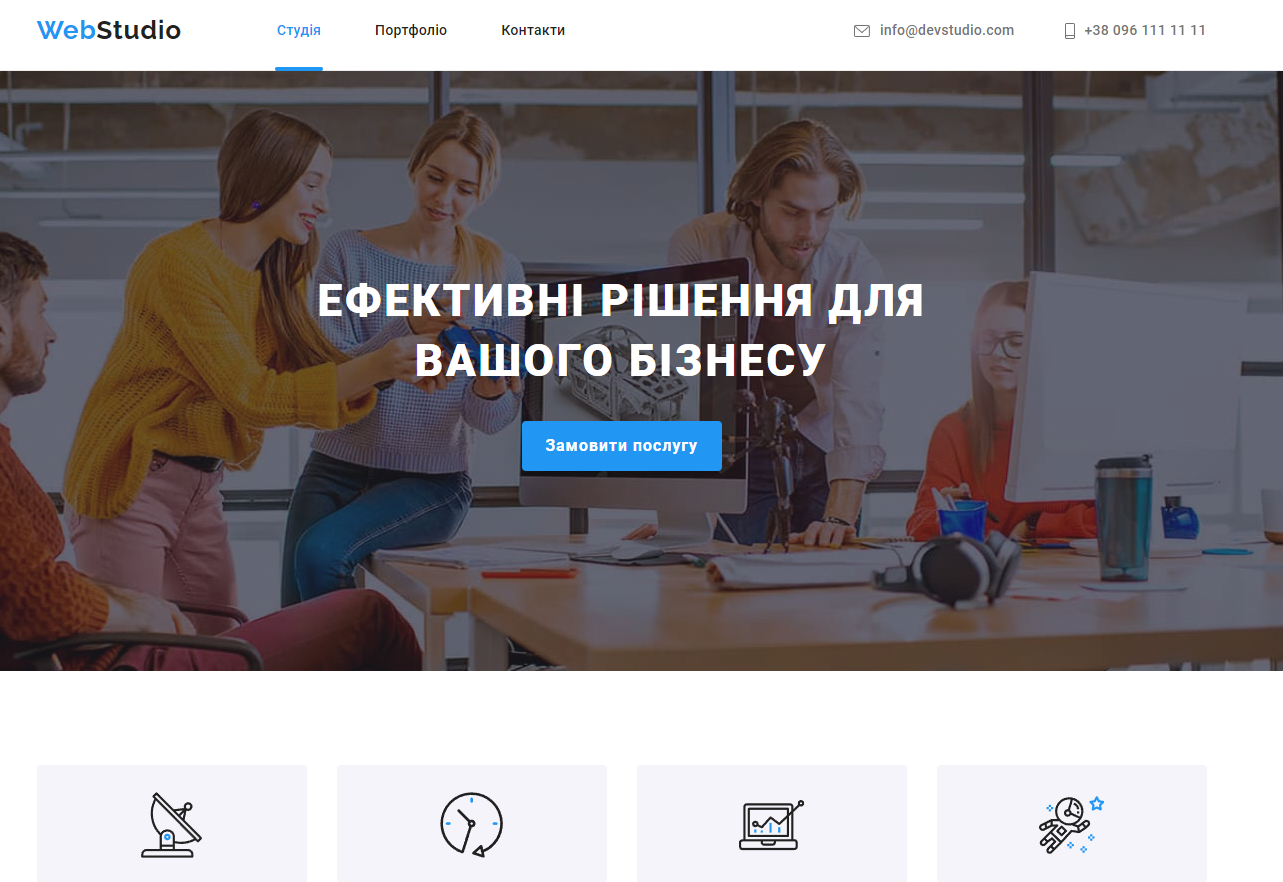
Header:
Agency logo.
Main menu with sections: "Studio," "Portfolio," "Contacts."
Button to open the mobile menu, which replaces the standard menu on smaller screens.
Hero Section:
Welcome text with a brief description of the agency: "Creative solutions for your business."
Call-to-Action (CTA) button inviting users to learn more about the studio.
Sections with Services and Portfolio:
List of key services offered by the agency: design, development, marketing.
Gallery of completed projects featuring previews and brief descriptions.
About the Studio Section:
Description of the agency's team, emphasizing experience and creative approach.
Gallery of employee images.
Contacts:
Information about the location, contact details, and feedback form.
Embedded map for easy navigation to the studio.
Footer:
Links to social media.
Copyright information and additional links to the privacy policy and terms of use.
Portfolio Page:
Project Gallery:
The portfolio page showcases a gallery with images and titles of projects completed by the agency.
Projects are categorized, for example, web design, application development, etc.
Clean Minimalist Design:
The gallery is arranged using a clear grid for harmonious element placement.
Images are optimized for fast loading and responsiveness.
Technologies Used:
HTML5: For structuring content using semantic markup, which improves SEO and accessibility.
CSS3: Used for styling:
Flexbox and CSS Grid: To create a responsive grid for the gallery and other elements, allowing them to restructure for different screens.
Media Queries: To ensure responsive design on various devices.
BEM Methodology: Applied for organizing CSS classes, making the code more understandable and maintainable.
Responsive Design:
The project is built with a Mobile-first approach, meaning initial attention is given to mobile devices, followed by adjustments for larger screens.
The menu and project gallery are adapted for different screen sizes using media queries.
Overall, the website is designed and developed with a modern approach, providing a user-friendly experience across all devices.
Main Elements of the Website:
Header:
Agency logo.
Main menu with sections: "Studio," "Portfolio," "Contacts."
Button to open the mobile menu, which replaces the standard menu on smaller screens.
Hero Section:
Welcome text with a brief description of the agency: "Creative solutions for your business."
Call-to-Action (CTA) button inviting users to learn more about the studio.
Sections with Services and Portfolio:
List of key services offered by the agency: design, development, marketing.
Gallery of completed projects featuring previews and brief descriptions.
About the Studio Section:
Description of the agency's team, emphasizing experience and creative approach.
Gallery of employee images.
Contacts:
Information about the location, contact details, and feedback form.
Embedded map for easy navigation to the studio.
Footer:
Links to social media.
Copyright information and additional links to the privacy policy and terms of use.
Portfolio Page:
Project Gallery:
The portfolio page showcases a gallery with images and titles of projects completed by the agency.
Projects are categorized, for example, web design, application development, etc.
Clean Minimalist Design:
The gallery is arranged using a clear grid for harmonious element placement.
Images are optimized for fast loading and responsiveness.
Technologies Used:
HTML5: For structuring content using semantic markup, which improves SEO and accessibility.
CSS3: Used for styling:
Flexbox and CSS Grid: To create a responsive grid for the gallery and other elements, allowing them to restructure for different screens.
Media Queries: To ensure responsive design on various devices.
BEM Methodology: Applied for organizing CSS classes, making the code more understandable and maintainable.
Responsive Design:
The project is built with a Mobile-first approach, meaning initial attention is given to mobile devices, followed by adjustments for larger screens.
The menu and project gallery are adapted for different screen sizes using media queries.
Overall, the website is designed and developed with a modern approach, providing a user-friendly experience across all devices.
 Odessa
  Available for hire