Bright identity and packaging for the frozen yogurt brand
Packaging and label design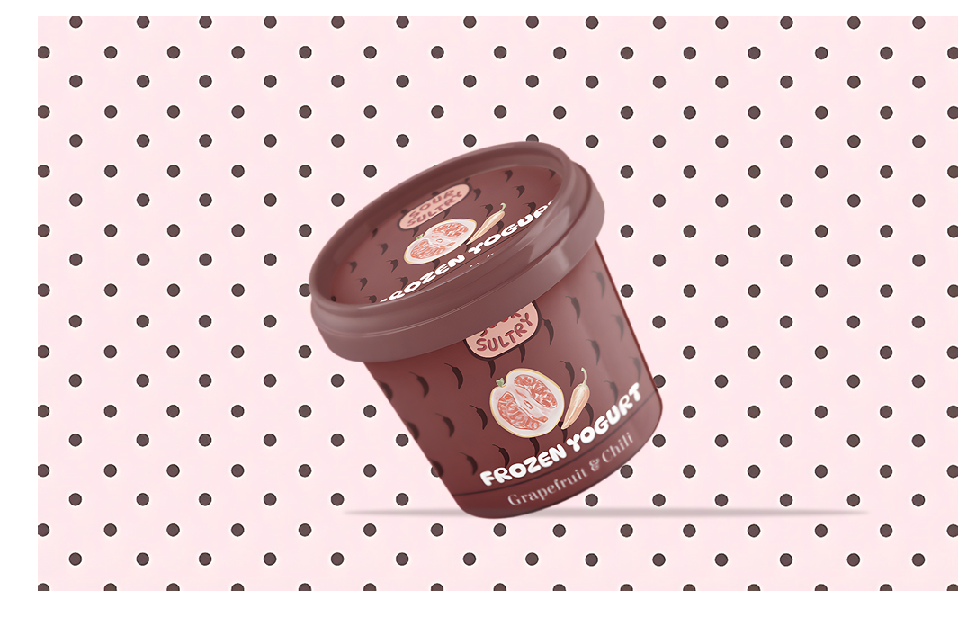
About the project: Packaging design for the bold frozen yogurt brand "SOUR SULTRY." The flavor "Grapefruit and Chili" dictated the visual language: a combination of sweetness, sourness, and spiciness.
Design solutions:
Color palette: A deep chocolate-burgundy background combined with a soft pink polka dot pattern creates a contrast between "spicy" and "sweet."
Illustrations: The use of graphic elements (chili peppers and grapefruit slices) for quick readability of the flavor.
Fonts: The use of soft, "stretchy" fonts that are associated with the texture of ice cream.
Goal: To stand out on the shelf among classic desserts and attract an audience ready for gastronomic experiments.