Candy packaging design (concept 1)
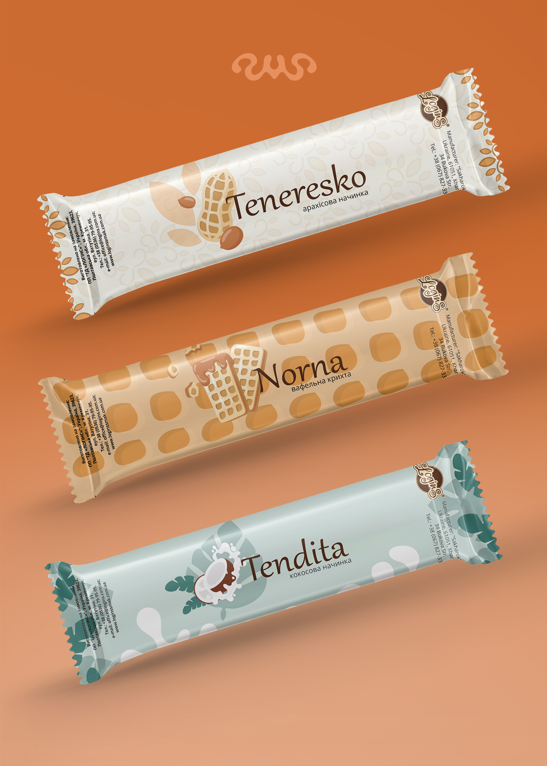
In this packaging series, I aimed to convey the essence of each flavor through visual imagery. Illustrations for the candies: peanuts, wafers, and coconut. Designed so that the consumer can immediately recognize the main ingredient before opening the wrapper.
Each flavor has its own color palette. For Teneresko - warm nutty shades that evoke associations with peanuts and caramel; for Norna - soft beige-golden tones that emphasize the wafer texture; for Tendita - delicate mint-white, associated with the lightness of coconut filling and freshness.
Also, each packaging has its own unique pattern in the background. I aimed for the overall style to be unified, but each flavor had its own feature: for peanuts, leaf and swirl ornaments; for wafers, a large wafer pattern; for coconut, large tropical leaves.
#packagingdesign #labeldesign #graphicdesign #productdesign #boxdesign #branding #packaging #productpackaging #labeldesign #brandstyle #printingdesign #printdesign #packaging #printdesign
 Vinnytsia