Candy packaging design (concept 2)
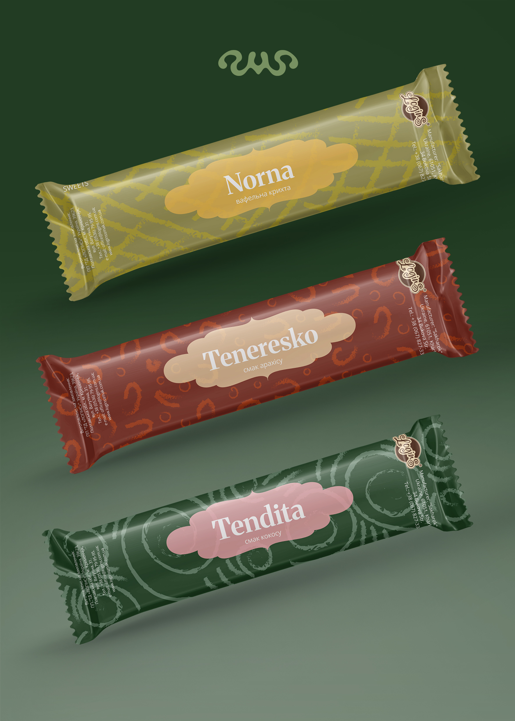
In this packaging concept, I rejected direct illustrations of flavors, emphasizing modern minimalism and abstract forms. Each flavor is conveyed not through images of ingredients but through color, rhythm, and ornament. This creates a more stylish, mature image that makes the product stand out on the shelf.
The color palette is built on deep and unconventional shades: for Teneresko - warm burgundy with soft golden accents, for Norna - muted olive-yellow with a warm light reflection, for Tendita - dark green combined with gentle pink. Such combinations create an extraordinary atmosphere and emphasize the uniqueness of each flavor.
Background patterns have become the main decorative element. They are abstract but hint at the character of the product: wavy lines and curls suggest coconut, a grid resembles waffle texture, and smooth circles convey peanut shapes.
#packagingdesign #labeldesign #graphicdesign #productdesign #boxdesign #branding #packagingdesign #productpackaging #labeldesign #brandstyle #printingdesign #printdesign #packaging #printingdesign
 Vinnytsia