About the project
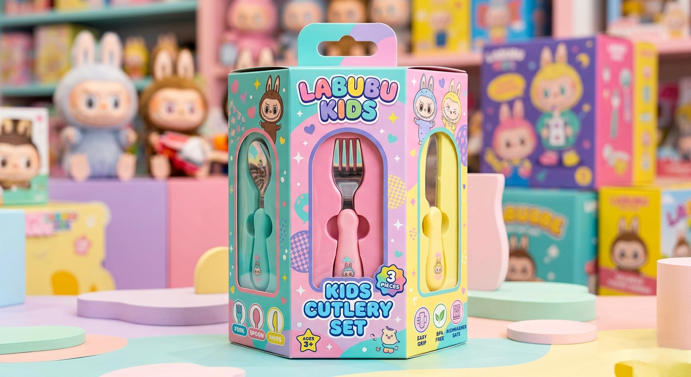
Product: Premium children's cutlery set of 3 items (spoon, fork, knife).
Task: Create unique, bright, and competitive packaging that stands out on supermarket shelves, evokes the emotion of a "desired gift" in children, while remaining clear and informative for parents (the main buyers, 70-80% are women).
Stylistics: Playful, Candy-style, Trendy Art Toy / Collectible aesthetics (reference - the Labubu universe).
1. Structural solution: Breaking the plane
Instead of a classic flat box, a compact hexagonal prism (Hexagon Box) has been developed.
Interactivity: The utensils are not lying in one plane but are arranged in a circle on three sides of the packaging (1 face = 1 utensil = 1 separate window). This encourages the child to rotate the box in their hands, turning unboxing into a game.
Compactness: The shape is designed so that the packaging does not look bulky or elongated. The height and width of the faces are mathematically tied to the dimensions of the utensils ($H = L + 30\text{ mm}$), optimizing logistics and shelf space usage.
Visibility: Three custom capsule windows with soft rounding provide 100% visibility of the shape and ergonomics of each utensil's handles from different angles.
2. Visual concept and Color scheme
The main taboo of the project is the rejection of a boring white background in favor of a juicy commercial "explosion".
Color palette: Based on "tasty", dense pastel shades (mint, lavender, marshmallow pink, warm yellow). The technique of Color-blocking and soft gradients is used, creating the effect of an expensive, trendy product.
Graphics and Characters: Inspired by the culture of collectible vinyl toys. Kawaii-ironic characters with big eyes and funny costumes create a strong emotional connection with the child.
Typography: Friendly, rounded 3D fonts with expressive outlines. Titles and informational blocks are styled like collectible stickers.
3. Marketing architecture of the faces (Unfolding)
The packaging is clearly divided by functionality for optimal perception:
3 Presentation front faces: Maximum focus on the product through windows. Minimal text - only large emotional branding and an accent label "3 Items Set".
Side zones: Trendy infographics (safety and ergonomics labels: Easy Grip, BPA Free, Ages 3+), which are instantly readable by parents.
Back face: Rational choice area for adults (technical text, composition, certification, barcode, and user instructions).
Result
A unique packaging concept has been created that successfully balances between two audiences. The product has received a premium visual status of "Art Toy", justifying a higher price segment on the shelf and stimulating impulse purchases due to the "wow-gift" effect.
Stack: Adobe Illustrator (stamp and vector graphics development), Adobe Photoshop (correction, texturing), Mind Journey / AI visualization (generation of conceptual ideas and renders of the unfolding).