Page design
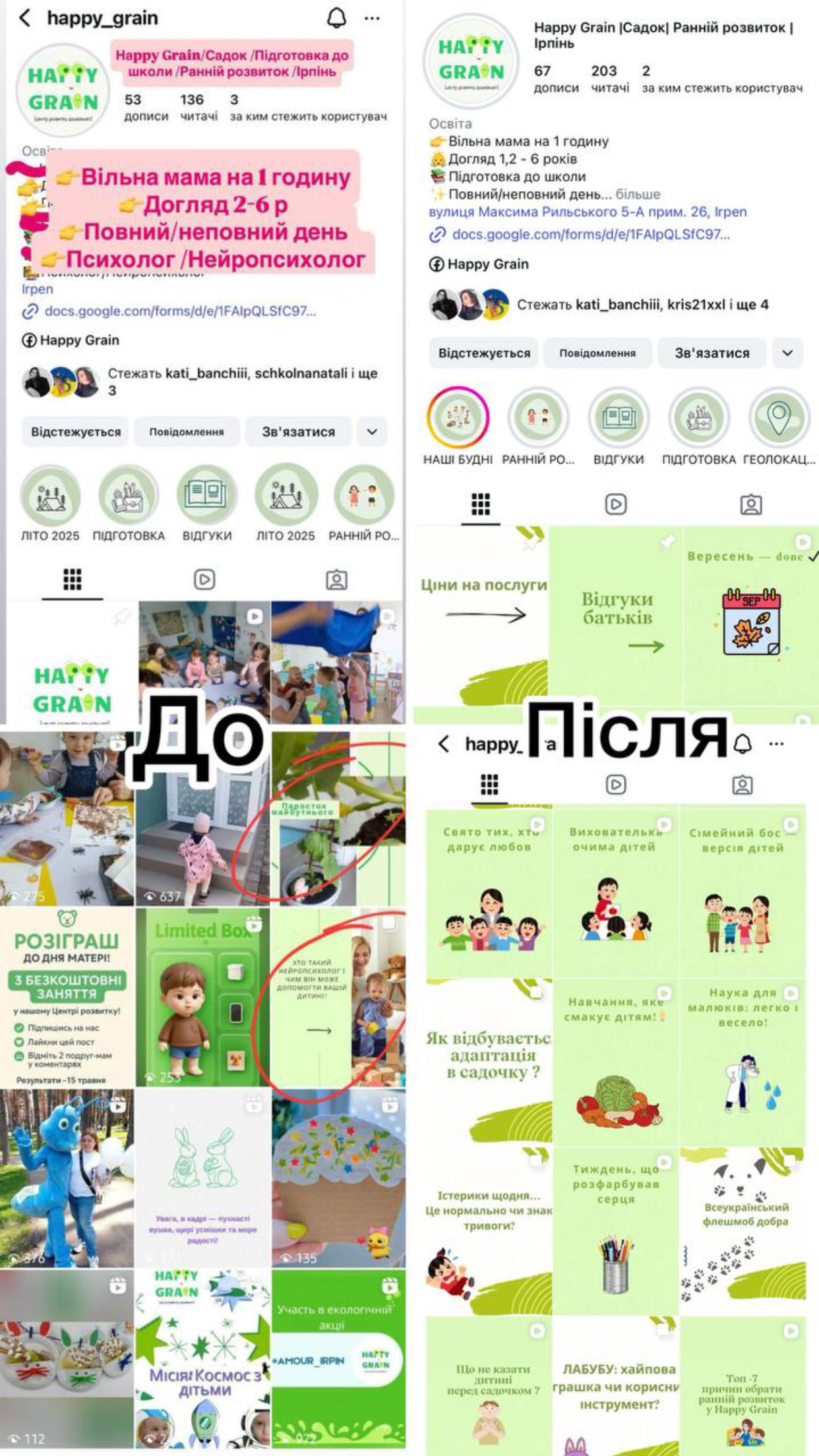
1. Profile header
Was: chaotic text with emojis, where it's hard to find the main point.
Became: structured description with clear blocks - services, target audience, and location are immediately visible. Added the address to increase trust.
2. Profile visual
Was: photos of varying quality, different colors, no unified style.
Became: branded green-beige style with illustrations that immediately associate with kindergarten, lightness, and care.
3. Content
Was: many "live" photos of children, but chaotic, without a meaningful block.
Became: structured infographics and carousels with valuable topics for parents: adaptation, tantrums, development, nutrition, science - this is expert content that inspires trust.
4. Highlights
Was: old circles without a unified style.
Became: minimalist icons with captions ("Our daily life," "Reviews," "Preparation," etc.) → looks neat, visually cohesive.
5. Communication strategy
Was: focus more on "we are a kindergarten, we have places."
Became: focus on the value for parents regarding what the child will receive, how adaptation goes, and how the kindergarten is beneficial. This is no longer just advertising, but warming up and building trust.
 Irpen
Irpen