Task: A large-scale redesign and repositioning of the ready-made breakfast brand. It was necessary to transition the product from a purely children's category to a teenage segmentation (12–16 years), refresh the mascot, develop packaging construction from scratch, and prepare a line of two SKUs for print.
Solution:
Strategic transformation of the mascot: Instead of an infantile character, a new image of Mr. Croco was created — a bold, energetic hero who shares the interests of modern teenagers. Three conceptual directions were developed for diversifying the line: extreme (motor culture/naked bike), urbanism (street art and graffiti), and esports.
Construction and layout (From scratch): An accurate vector cut of the cardboard box was designed. Optimal flaps for automated gluing, creasing lines, and cut-out extensions were calculated, ensuring perfect assembly on production lines.
Adaptation and layout of the line (2 SKUs): A universal modular grid was developed for two flavor positions (cocoa with sesame and condensed milk). Clear color differentiation and dynamic food zones with a 3D splash effect were created.
Bilingual typography: Complex technical and marketing information (ingredients, nutritional value, promo blocks) was integrated in two languages (UA/EN) without overloading the composition.
Technical parameters of the project
Product: Dry breakfasts (rings), 75 g.
Type of packaging: Cardboard box (chromerzats), full-color printing (CMYK).
Scope of work: Development of construction (die), illustration, layout of the line, pre-press preparation.
Conceptual trilogy of the line (3 SKUs)
To cover the maximum interests of the modern teenage audience, three independent visual concepts were developed. Each of them not only changes the color of the packaging but immerses the consumer in a separate subculture:
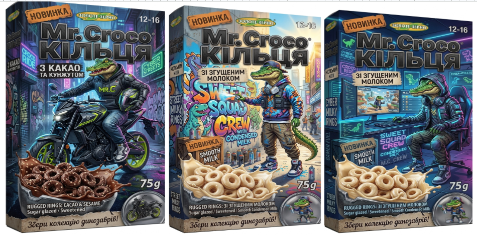
Concept 1: Croco Ride (Flavor: Cocoa and sesame)
Aesthetics: Aggressive night urbanism, neon lights of the metropolis.
Plot: Mr. Croco as a biker on a custom naked bike (inspired by Yamaha MT-03). Acid green and deep dark accents emphasize the rich chocolate flavor of the product and create an atmosphere of speed and drive.
Concept 2: Street Squad Crew (Flavor: With condensed milk)
Aesthetics: Daytime street art, sunny juicy urban.
Plot: The mascot as a street artist-muralist with a spray can and wearing a respirator. A bright, warm palette and light shades perfectly differentiate the delicate milk flavor, while a graffiti wall adds texture to the composition.
Concept 3: Cyber Athlete (Alternative brand concept)
Aesthetics: Technological gamer lair, digital cyber aesthetics.
Plot: Mr. Croco as a professional esports player and game developer in a top ergonomic chair in front of curved monitors. Complex blue-purple LED lighting and programming interface elements appeal to the gaming community.
Result
A flexible and viable visual system was created, where the mascot transforms along with trends. The project demonstrates how a brand can grow with its audience, transforming from a "children's dry breakfast" into a cool, desirable teenage merchandise.
Solution:
Strategic transformation of the mascot: Instead of an infantile character, a new image of Mr. Croco was created — a bold, energetic hero who shares the interests of modern teenagers. Three conceptual directions were developed for diversifying the line: extreme (motor culture/naked bike), urbanism (street art and graffiti), and esports.
Construction and layout (From scratch): An accurate vector cut of the cardboard box was designed. Optimal flaps for automated gluing, creasing lines, and cut-out extensions were calculated, ensuring perfect assembly on production lines.
Adaptation and layout of the line (2 SKUs): A universal modular grid was developed for two flavor positions (cocoa with sesame and condensed milk). Clear color differentiation and dynamic food zones with a 3D splash effect were created.
Bilingual typography: Complex technical and marketing information (ingredients, nutritional value, promo blocks) was integrated in two languages (UA/EN) without overloading the composition.
Technical parameters of the project
Product: Dry breakfasts (rings), 75 g.
Type of packaging: Cardboard box (chromerzats), full-color printing (CMYK).
Scope of work: Development of construction (die), illustration, layout of the line, pre-press preparation.
Conceptual trilogy of the line (3 SKUs)
To cover the maximum interests of the modern teenage audience, three independent visual concepts were developed. Each of them not only changes the color of the packaging but immerses the consumer in a separate subculture:
Concept 1: Croco Ride (Flavor: Cocoa and sesame)
Aesthetics: Aggressive night urbanism, neon lights of the metropolis.
Plot: Mr. Croco as a biker on a custom naked bike (inspired by Yamaha MT-03). Acid green and deep dark accents emphasize the rich chocolate flavor of the product and create an atmosphere of speed and drive.
Concept 2: Street Squad Crew (Flavor: With condensed milk)
Aesthetics: Daytime street art, sunny juicy urban.
Plot: The mascot as a street artist-muralist with a spray can and wearing a respirator. A bright, warm palette and light shades perfectly differentiate the delicate milk flavor, while a graffiti wall adds texture to the composition.
Concept 3: Cyber Athlete (Alternative brand concept)
Aesthetics: Technological gamer lair, digital cyber aesthetics.
Plot: Mr. Croco as a professional esports player and game developer in a top ergonomic chair in front of curved monitors. Complex blue-purple LED lighting and programming interface elements appeal to the gaming community.
Result
A flexible and viable visual system was created, where the mascot transforms along with trends. The project demonstrates how a brand can grow with its audience, transforming from a "children's dry breakfast" into a cool, desirable teenage merchandise.