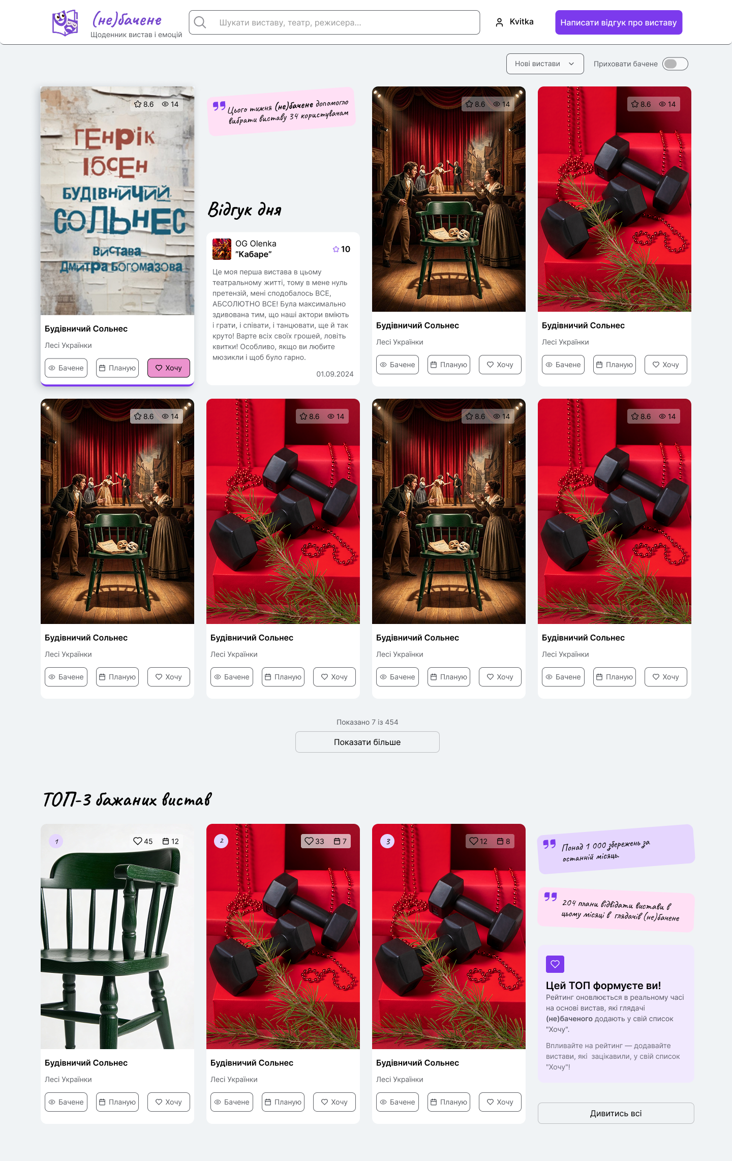
Niche: Digital Services / Entertainment
Specification: SaaS diary of experiences and theatrical events.
Specific checklist: presence of a clear value proposition on the first screen, convenient flow for adding feedback/emotion (minimization of input fields), intuitive navigation of the exhibition catalog.
Redesign goal: reduction of cognitive load when filling out the diary, improvement of visual hierarchy for attention management (F-pattern) and bringing the interface to accessibility standards (Accessibility, WCAG 2.2), which directly affects user retention rates and conversion rates to the target action.
Problem:
The original website suffered from high cognitive load, non-obvious visual hierarchy of key actions, and shortcomings in mobile adaptation (small buttons, low contrast), which hindered quick user engagement in diary keeping.
Solution:
The redesign performed a systematic cleaning of the interface from "visual noise." Mobile First principles were implemented (increased touch targets), contrast was adapted according to WCAG 2.2 standards, the main CTA was highlighted, and content was structured according to the laws of Gestalt psychology (Law of Proximity).
Result:
The interface transformed from a passive catalog to a convenient SaaS tool. The redesign significantly reduced Interaction Cost, making the process of adding emotions quick and intuitive. This is expected to increase audience engagement and convert one-time visitors into regular diary users.