Development of a landing page on Shopify for the German brand Heilkorn
Website Development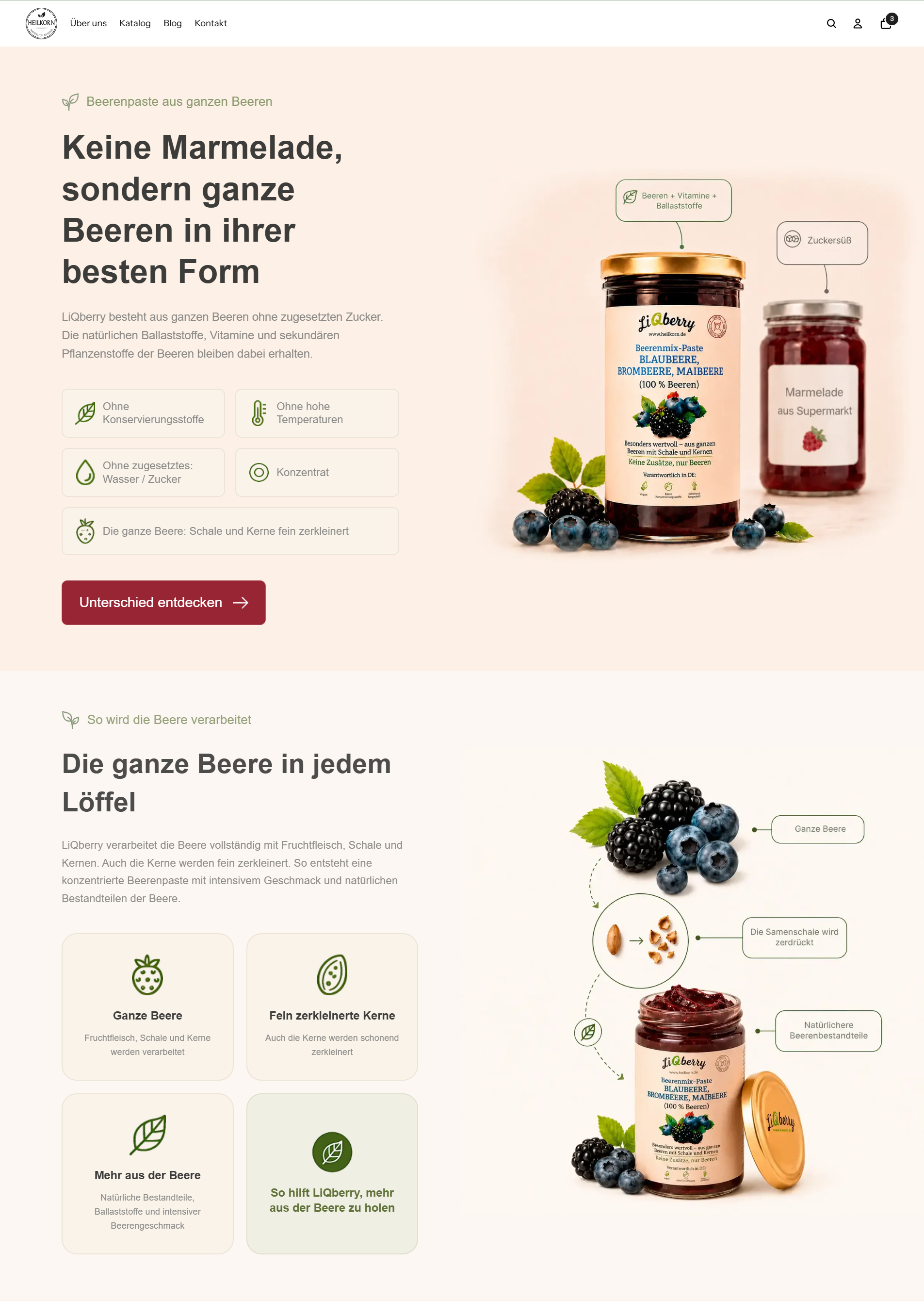
I successfully implemented a project for the development, customization, and full deployment of a new landing page for the active online store https://heilkorn.de/. The main goal was to create a modern, easily editable, and perfectly mobile-optimized page that completely replaced the old homepage of the site.
The work was carried out directly based on the client's current Shopify theme, seamlessly preserving the global elements of the site (Header and Footer) and the original cart logic (AJAX / Drawer Cart).
What was done:
1. Design project and adaptation based on the concept
I implemented a unique landing structure using the layout as a visual reference. I independently selected, adapted, and optimized all graphic elements, benefit icons, and images to fit the brand's corporate style.
I maintained a clear order and logic of blocks: the first screen focused on the CTA, a technology block, an interactive paste selection, application methods, a set configurator, a feedback block with a disclaimer, a delivery section, and a final call to action.
2. Development of complex interactive functionality (Liquid + JS)
Dynamic product card: I created a block for selecting berry paste. When the user switches berries without reloading the page, images, names, descriptions, and the associated product ID for the "Add to Cart" button are instantly updated.
Interactive set configurator: I implemented the logic for choosing between sets of 5 or 7 mini-pastes. The add to cart button dynamically reads the selected option and sends exactly the set specified by the user to the AJAX cart.
Feedback slider and FAQ accordion: I developed flexible blocks with clean logic for switching slides and accordions, eliminating any conflicts with existing theme scripts.
3. Full content management from the Shopify admin panel
I made the page as autonomous as possible for the client. All headings, subheadings, descriptions, benefit cards, links, berry lists, products in sets, questions in the FAQ, and reviews can now be easily added, deleted, or edited directly through the Shopify section settings interface or through clean structured code areas.
4. Mobile adaptation (Mobile-First)
Since mobile traffic was a priority, I conducted surgical adjustments to the CSS styles (specifically, flex/inline-flex components and margin distribution). This ensured perfect centering of headings, badges, and graphics on smartphone screens, complete readability of texts, and convenience of clickable areas without horizontal scrolling.
5. Technical optimization and SEO
I built the correct semantic hierarchy of tags (one H1, sequential H2/H3), wrote alt texts for images, and configured meta-data to eliminate technical duplicates.
I improved loading speed metrics to optimal values within the current theme architecture by compressing graphics, implementing lazy loading for elements below the first screen, and eliminating heavy third-party libraries.
Result:
The project was developed and tested on a separate test URL without interrupting the current sales of the store. After the final check (functionality of buttons, cart, browser console for errors), I successfully transferred the page to the main domain. The client received a conversion-optimized, fully manageable homepage that displays perfectly on any device and is ready for further scaling.
The work was carried out directly based on the client's current Shopify theme, seamlessly preserving the global elements of the site (Header and Footer) and the original cart logic (AJAX / Drawer Cart).
What was done:
1. Design project and adaptation based on the concept
I implemented a unique landing structure using the layout as a visual reference. I independently selected, adapted, and optimized all graphic elements, benefit icons, and images to fit the brand's corporate style.
I maintained a clear order and logic of blocks: the first screen focused on the CTA, a technology block, an interactive paste selection, application methods, a set configurator, a feedback block with a disclaimer, a delivery section, and a final call to action.
2. Development of complex interactive functionality (Liquid + JS)
Dynamic product card: I created a block for selecting berry paste. When the user switches berries without reloading the page, images, names, descriptions, and the associated product ID for the "Add to Cart" button are instantly updated.
Interactive set configurator: I implemented the logic for choosing between sets of 5 or 7 mini-pastes. The add to cart button dynamically reads the selected option and sends exactly the set specified by the user to the AJAX cart.
Feedback slider and FAQ accordion: I developed flexible blocks with clean logic for switching slides and accordions, eliminating any conflicts with existing theme scripts.
3. Full content management from the Shopify admin panel
I made the page as autonomous as possible for the client. All headings, subheadings, descriptions, benefit cards, links, berry lists, products in sets, questions in the FAQ, and reviews can now be easily added, deleted, or edited directly through the Shopify section settings interface or through clean structured code areas.
4. Mobile adaptation (Mobile-First)
Since mobile traffic was a priority, I conducted surgical adjustments to the CSS styles (specifically, flex/inline-flex components and margin distribution). This ensured perfect centering of headings, badges, and graphics on smartphone screens, complete readability of texts, and convenience of clickable areas without horizontal scrolling.
5. Technical optimization and SEO
I built the correct semantic hierarchy of tags (one H1, sequential H2/H3), wrote alt texts for images, and configured meta-data to eliminate technical duplicates.
I improved loading speed metrics to optimal values within the current theme architecture by compressing graphics, implementing lazy loading for elements below the first screen, and eliminating heavy third-party libraries.
Result:
The project was developed and tested on a separate test URL without interrupting the current sales of the store. After the final check (functionality of buttons, cart, browser console for errors), I successfully transferred the page to the main domain. The client received a conversion-optimized, fully manageable homepage that displays perfectly on any device and is ready for further scaling.