Budget: 500 UAH Deadline: 2 days
Добрый день. Буду рада сотрудничеству.
Портфолио и контакты на моем сайте http://nikolaevamaria.wix.com/nikadesign
Добрый день, необходимо показать преимущества такого товара как рыбацкий шнур\плетенка. Возможно сделать что-то вроде инфографики в фирменном стиле. Название товара, его картинки и брендбук сбросим исполнителю.
Бриф
В наше время все чаще рыбаки используют шнур вместо лески и это не удивительно. Он способен выдержать значительно больше нагрузки, чем леска аналогичного диаметра. Плетенные шнуры. Это классический вариант рыболовных шнуров в которых волокна формируются в нити, нити переплетаясь между собой формируют более толстые нити и так далее. Чем сложнее и хитромудрее это плетение, тем крепче будет рыболовный шнур. По сути число нитей во всех плетёных лесках колеблется от 3 до 8. Каждая нить в свою очередь состоит из тончайших волокон.
Покраска, пропитка и покрытие. Покраску имеют практически все плетёные лески, а пропитку и специальное покрытие лишь немногие. Пропитка почти не снижает прочность, делает плетёную леску более плотной и круглой (при условии правильного плетения), но с другой стороны – немного увеличивает её диаметр. Покрытие (чаще всего его называют силиконовым, хоть силикона там и в помине нет) – это фишка для первой рыбалки. Шнур в руках обалденный – скользкий, гладенький.
Картинка-Преимущество №1
Si - special silicone coating - это силиконовая пропитка.
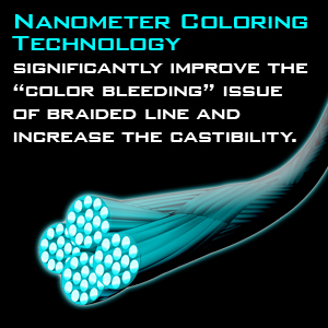
Надо показать на картинке 4х жильный плетеный шнур в разерезе, а так же эту силиконовою пропитку. За счет нее шнур приобретает дополнительное высокое смазывающее качество обеспечивающие отличные антифрикционные свойства. Надо показать так же что шнур имеет круглую форму без бугров.
Преимущества Si:
Пару картинок из интернета которые могут натолкнуть на правильные мысли


* в процессе добавления ТЗ, итого будет 5-6 картинок
Budget: 500 UAH Deadline: 2 days
Добрый день. Буду рада сотрудничеству.
Портфолио и контакты на моем сайте http://nikolaevamaria.wix.com/nikadesign
Budget: 550 UAH Deadline: 2 days
Здравствуйте. Все понятно.. Сделаю.

Budget: 500 UAH Deadline: 3 days
Готов к труду и обороне.
Портфолио: Freelancehunt
Budget: 300 UAH Deadline: 2 days
Здравствуйте! Сделаю быстро, качественно и понятно, обращайтесь.
_______________________
[email protected]

Good day. I request a response from those who have subscriptions to image generation services (ChatGPT performs well), I will send details and instructions to candidates privately, the initial volume will be a test, conditionally 2,000 UAH, later we will purchase the necessary subscription and try to set things in motion. The work is creative and interesting.
Marina, I apologize for the delay. Thank God we are back. Now for the work, if you are free, of course. The first volume is the English version, different cover, everything else as it was, dividers, epigraphs. Seven Spectra, MARYNA TOLMACHOVA If possible, make the title as the AI advised me. Typography of the "Seven Spectra" series) 1. Font style (Vibe): Main title: A modern, elegant serif font is needed. It should look magical but not "childish." References (free): Cinzel Decorative, Bellefair, Playfair Display, Cormorant Garamond. References (paid/Adobe): Lovelace, Orpheus Pro, Recoleta. Important: Avoid standard fonts like Times New Roman or overly ornate "handwritten" fonts that are hard to read. 2. Composition and effects: Placement: The title "Seven Spectra" — in the upper third of the image. The author's name — at the bottom, under the characters' feet. Texture: Apply a light gold foil effect or a soft gradient from light beige to golden on the letters. This will add a premium feel. Glow (Outer Glow): Add a very soft, barely noticeable glow around the letters (color — pale lemon or white) so that the text "stands out" from the purple background and becomes readable. 3. Working with details: Kerning (spacing between letters): Increase the letter spacing in the title and author's name. "Stretched" inscriptions look more fashionable and expensive now. Ligatures: If possible, use decorative ligatures between letters (for example, connect S and T) so that the title looks like a unique logo. 4. Text hierarchy: Title: The largest. Series (Book 1): In a thin, simple sans-serif font right above or below the title. Author's name: Medium size, in all caps, with a large letter spacing. Font: A beautiful, slender serif font is needed (these are the little lines at the ends of letters). Don't take something ordinary like in newspapers; choose something elegant, like on the covers of Western bestsellers. Spacing: Let the letters "breathe." Don't stick them too close together; make more space between them (this is currently the main trend in fashion). Text color: Don't just make it white. Try ivory or soft gold. The letters should slightly glow to be easily readable on the purple background. Placement: Title ("Seven Spectra") — at the top, large. Author's name — at the bottom, in smaller letters, but also with large spacing between them. "Volume" effect: Ask her to make it so that the lavender branches or the edges of the magical whirlwind slightly "overlap" the letters. As if the title is inside this world, not just stuck on top. And the most important advice: Ask her to make the title larger. On Amazon, people look at covers the size of a postage stamp. If the title is small and "modest," no one will notice it. Is that clearer? If she asks, "What style should I do?" just say: "The style of expensive modern fantasy, focusing on elegance and airiness." She will understand everything! So, shall we send such a task or add something else? There may be errors in the responses of the artificial intelligence. I really don't understand what he is writing about.
