1. Challenge
The client reached out with a request to promote a specific product that is difficult to sell "head-on" through cold traffic. Previous attempts to launch advertising on social media did not yield stable results. The main question was what is more effective: creating a separate landing page for the specific product or optimizing the current online store.
2. Audit
We conducted a Funnel Drop-off Analysis and analyzed user behavior on the site. The data showed that the main losses occur even BEFORE adding the product to the cart.
3. Insights and UX Issues
Despite a sufficient number of product views, users did not reach the decision-making stage for purchase. The focus of the analysis shifted to the product card. We found that:
- key information about the product was hidden in a long text description;
- users had to scroll through up to 6 screens in the mobile version to get all the important information;
- product variations were only located at the bottom of the page;
- the page explained the product but did not help users make a quick purchase decision.
4. Optimization Strategy
After analyzing user behavior, we determined that the main problem lies in the product familiarization and purchase decision-making stage. On the other hand, analysis of statistics in Serpstat showed a high frequency of queries in Google for this product. Therefore, it is more appropriate to "catch" hot buyers through shopping ad campaigns in Google and then retarget them on social media. Thus, instead of creating a separate landing page, it was decided to focus on optimizing the current site and product cards. The main strategy:
- shorten the user's path to key information
- simplify the perception of a complex product
- adapt product cards for Google Shopping
- improve navigation and catalog structure
5. Implemented Changes
Change in card structure
Long text descriptions were moved to collapsible blocks (accordion sections) to reduce cognitive load and focus the user's attention on the key advantages of the product.
Infographics
Long text descriptions were replaced with infographics that quickly explain the key advantages of the product and its operation principle.
Banner with examples of infographics
3) Change in product variation logic:
different types of products were separated into individual pages
interlinking was added through variations and "Similar Products" blocks
Screens from BEFORE (variations at the bottom) - After (variations by color and related products)
4) Optimization of SEO structure of pages
moved the product from a deep subcategory to one of the main categories of the site
prepared new titles, descriptions, and meta descriptions for Google Shopping
6. Result
In the first month after launching advertising on the updated product cards, we saw a significant improvement in micro-conversions.
Banner / visual No. 8
Results:
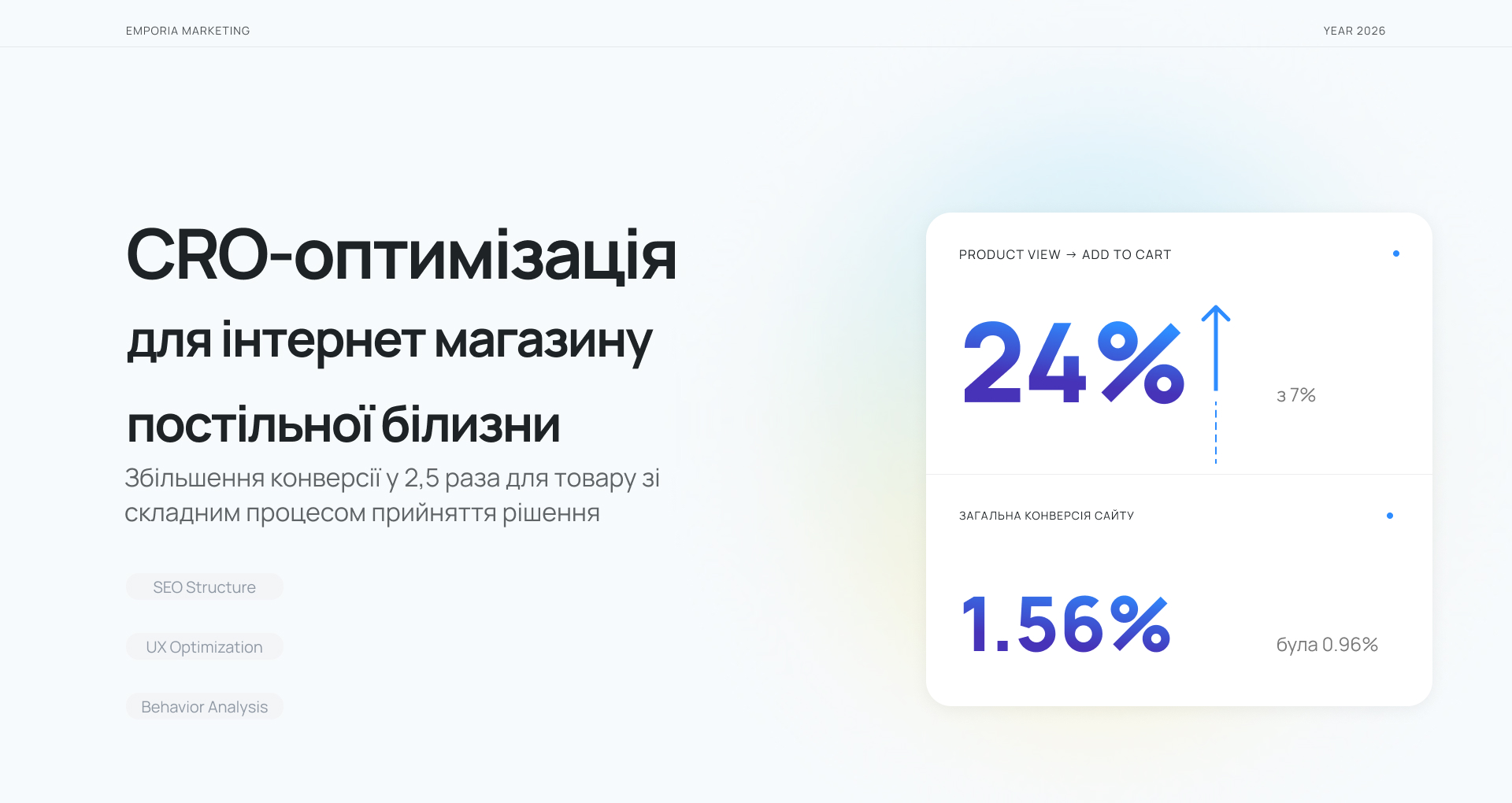
Product View → Add to Cart:
7% → 24%
Overall Website Conversion Rate:
0.96% → 1.56%
Reduction in drop-off at the decision-making stage
Final Conclusion
This project showed that CRO optimization is much more than working with heatmaps or changing the interface. To increase the conversion of a complex product, we combined behavioral analytics, UX optimization, SEO structure, and traffic acquisition strategy into one system. We focused not only on UI changes but also:
- identified the most effective traffic acquisition channels,
- adapted product cards for Google Shopping,
- improved category structure and SEO,
- simplified the decision-making process for the user,
- optimized content presentation based on real audience behavior.
This approach allowed us not only to increase micro-conversions but also to improve the overall effectiveness of advertising traffic and site conversion.
The client reached out with a request to promote a specific product that is difficult to sell "head-on" through cold traffic. Previous attempts to launch advertising on social media did not yield stable results. The main question was what is more effective: creating a separate landing page for the specific product or optimizing the current online store.
2. Audit
We conducted a Funnel Drop-off Analysis and analyzed user behavior on the site. The data showed that the main losses occur even BEFORE adding the product to the cart.
3. Insights and UX Issues
Despite a sufficient number of product views, users did not reach the decision-making stage for purchase. The focus of the analysis shifted to the product card. We found that:
- key information about the product was hidden in a long text description;
- users had to scroll through up to 6 screens in the mobile version to get all the important information;
- product variations were only located at the bottom of the page;
- the page explained the product but did not help users make a quick purchase decision.
4. Optimization Strategy
After analyzing user behavior, we determined that the main problem lies in the product familiarization and purchase decision-making stage. On the other hand, analysis of statistics in Serpstat showed a high frequency of queries in Google for this product. Therefore, it is more appropriate to "catch" hot buyers through shopping ad campaigns in Google and then retarget them on social media. Thus, instead of creating a separate landing page, it was decided to focus on optimizing the current site and product cards. The main strategy:
- shorten the user's path to key information
- simplify the perception of a complex product
- adapt product cards for Google Shopping
- improve navigation and catalog structure
5. Implemented Changes
Change in card structure
Long text descriptions were moved to collapsible blocks (accordion sections) to reduce cognitive load and focus the user's attention on the key advantages of the product.
Infographics
Long text descriptions were replaced with infographics that quickly explain the key advantages of the product and its operation principle.
Banner with examples of infographics
3) Change in product variation logic:
different types of products were separated into individual pages
interlinking was added through variations and "Similar Products" blocks
Screens from BEFORE (variations at the bottom) - After (variations by color and related products)
4) Optimization of SEO structure of pages
moved the product from a deep subcategory to one of the main categories of the site
prepared new titles, descriptions, and meta descriptions for Google Shopping
6. Result
In the first month after launching advertising on the updated product cards, we saw a significant improvement in micro-conversions.
Banner / visual No. 8
Results:
Product View → Add to Cart:
7% → 24%
Overall Website Conversion Rate:
0.96% → 1.56%
Reduction in drop-off at the decision-making stage
Final Conclusion
This project showed that CRO optimization is much more than working with heatmaps or changing the interface. To increase the conversion of a complex product, we combined behavioral analytics, UX optimization, SEO structure, and traffic acquisition strategy into one system. We focused not only on UI changes but also:
- identified the most effective traffic acquisition channels,
- adapted product cards for Google Shopping,
- improved category structure and SEO,
- simplified the decision-making process for the user,
- optimized content presentation based on real audience behavior.
This approach allowed us not only to increase micro-conversions but also to improve the overall effectiveness of advertising traffic and site conversion.